Medical biology and website visual design solutions
Share 22 medical websites and explain the steps for disseminating medical-related design thinking to learn how Gold 15' goes about landing projects.
View More

Mechanical industry construction site solutions, and explain the steps of mechanical industry related design thinking distribution, understand how gold 15' is to start the project landing.
Body text:
Since the reform and opening up, we have almost completed an industrial revolution every ten years or so, the first time represented by light industries such as textiles, the second time represented by electricity, internal combustion engines, household appliances, petrochemical industries and medium and high-end infrastructure, and the third time represented by information technology and communications industries. At present, the fourth industrial Revolution represented by big data, artificial intelligence, quantum communication, etc., is dramatically changing the way humans live and operate. Familiar industrial brands fill our lives, and these companies are also actively using the Internet to export their strength and gain more partners.
|
The core thinking of building a website from top to bottom allows enterprises to maximize the benefits of the display of Internet platforms.
|
|
The time that the user finds the enterprise website on the Internet, the time that the user stays on the web page, the useful information of the user is transmitted in a limited time, and the user transformation is achieved after a certain time.
|
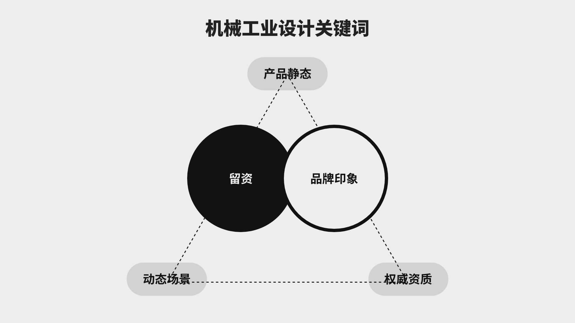
Machinery industry, the first feeling to the user is cold, professional, the product has become the core output of the enterprise, how to use the website to show the professional quality of the product, show the authority of the enterprise, strength, access to more opportunities for cooperation and exchange, "strength" is definitely the industry's most priority word, and "stay" is the necessary section of the enterprise.
In the production of such projects, we seize these two keywords, combined with the company's own product planning, starting from the first screen of the website, we need to show the core features of our products: Practicality, diversification, customization, high quality, high technology, etc., the use of product static or dynamic scenarios + authority qualification + retention to build a website that can let users leave information within 15'.
|
Around the enterprise brand promotion and operation as the core, create brand memory points, express the professionalism of the industry through professional design, and achieve high transformation of the brand website.
|
Industrial industry, conceptually divided into two categories, one is heavy industry, iron and steel, metallurgy, large equipment manufacturing and other departments to provide means of production, such as: Sanhe Intelligent, Xugong Group, Sany Heavy Industry and other enterprises; One is light industry, such as household appliances, batteries, ceramics, hardware, daily chemicals, paper, printing, toys and other production and consumption materials, such as: Midea Group, Haier Group, Zhuhai Gree Electric Appliances. Machinery industry brand, strength, capital, supply, labor, market share, patents, are the stepping stone for cooperation, we need to focus on this industry, emphasize our strength, and join our brand spirit, brand concept, corporate vision values, in addition to the authority to show the enterprise's temperature, enthusiasm, future development of perseverance and vitality.
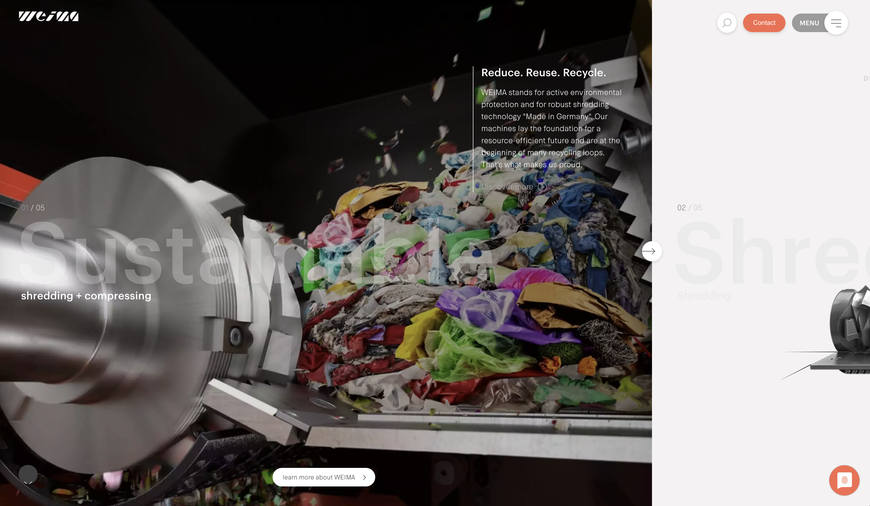
(The mechanical dynamics combined with linear demonstration on the first screen of ⬇️weima.com is impressive)

|
We need to cope with the rapid change of the environment, website content synchronization even needs to be ahead of the development of the enterprise, website planning will be combined with the comprehensive consideration of the current and future development of the enterprise, through the precipitation on the Internet, to obtain enough data, to analyze user behavior habits and preferences, to iterate the website and even iterate the product, so as to obtain continuous transformation.
|
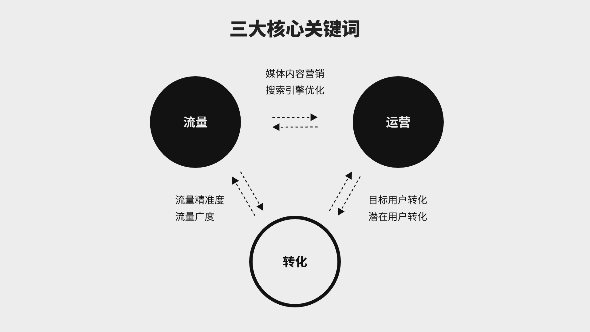
Master the flow, transformation, operation of the three core keywords, the vast majority of the target group of the machinery industry is toB, the dealer section is an indispensable part of this type of website, an accurate form is the best channel for dealer information acquisition. After the professional degree of the product and the advantages of the enterprise itself, the design of the contact us is also a sophisticated layout, in addition to the form, we need to have perfect contact information, not only the phone, wechat, mailbox, telephone, online consultation, are essential content. We need to know that traffic can be bought, conversion requires skill, operation requires brains, and we want the website to play its maximum value.
二、Gold 15 seconds landing plan
|
Time thinking - how fast and slow the user lands, long and short
Brand thinking - logic and blocks around the core content
Business thinking - quantitative feedback and iteration
|
1. Mechanical industry website features
Based on the same market environment and target groups, we focus on "tob enterprises", website needs have certain commonalities.
Mainly in the following four aspects:
Attach importance to enterprise strength display
Machinery industry needs strong corporate strength and R & D technology, we need to combine layout design, visual atmosphere, technology, technology, product advanced display to reflect the strength of our enterprise.
Pay attention to the product display scene
The application scenario of the machinery industry is one of the core competitiveness of the enterprise, we need to combine the product and the scene, to convey the feasibility of the mechanical application to the user.
Focus on collaboration and branding
Straightforward product and enterprise strength display is for the smooth progress of large transactions, we show the brand at the same time, need to consider the entry of cooperation and intention of customers message consultation.
Differentiated experience
We have seen too many plain narrative website design schemes, under the premise of technical rigor, we need to show the differentiation of the brand through code technology and design capabilities, and bring users different experience and memory points.
What we call corporate positioning refers to the scale of the enterprise in the industry, such as listed groups, well-known enterprises in the industry, the world's top 500, China's top 500, or the competitive advantage in a certain circle, start-ups, etc., with corporate positioning, we can get the target group and audience size, and the design of unique space, so that the website presentation makes it recognized by more people.
Combine the services provided by the enterprise
|
Heavy industry, steel, metallurgy, large equipment manufacturing, etc.; Light industry, home appliances, batteries, ceramics, hardware, daily chemicals, paper making, printing, toys, etc.
|
Combine enterprise industry positioning/expectations
|
Giant industry, innovative industry, dealers, distributors, partners
|
We emphasize the development of enterprises, Internet information transmission can give priority to the appearance of the future development of enterprises, create well-known brands, focus on the business circle, large-scale customization, small retail online sales network, we can combine the future planning of enterprises, reserve the section location and data interface.
Combined with enterprise industry positioning/expectations:
Professionals, customized needs, government units, suppliers
|
Short term promotion/medium term empowerment/long term precipitation
|
The demand of the machinery industry is the most direct and straightforward "show products and strength", bidding website or listing website or publicity website, we need to highlight the strength of the enterprise, and through the quality of product display and solutions or cases, to describe the advantages of cooperation in the industry.
2.3 Competitive product research
|
The analysis of competitive products we do is not only the parallel competitive products of customer enterprises, but also the analysis of high-quality page views and websites with high conversion rates. We will analyze the commonalities of these columns and get the best reading method and layout presentation method for user behaviors. For example, for the presentation of large-scale industrial products, there are more customized needs, and the supporting display of the scene is essential. We need to emphasize the user's behavior habits and ultimate purpose, which can make the user land more quickly generated conversion, to avoid the unimaginative thereby consuming the user's residence time.
|
3. Website content arrangement and column planning
|
Raw data ➡️ classification and collation ➡️ primary and secondary structure and visual priority logic ➡️ section presented
|
In the section planning of such enterprises, solutions/products and about us are generally in the first place, combined with the actual information and resources of the enterprise, we supplement and complete columns such as investor information and cases.

4. Gold 15 second design point
Extract and sort out the conclusions of demand analysis and competitive product analysis, so as to efficiently capture design points and create brand visual points through divergent thinking.
By integrating the advantages of competitive products and bringing inspiration, we need to take their essence, combined with our own products through the design of further brand support.
Try to avoid making "common sense" mistakes, such as using simple button navigation in a multi-category navigation design, by describing the shortcomings of competing products and the opportunities of your own products.
We will combine the golden 15 'design key points to help you determine the overall visual goals of the website, behavioral goals, interactive goals, brand goals, so that users quickly land, in the limited time to browse the web to generate active user information. We will acquire customers in real time through convenient online conversations and convenient form messages, and create space for customer stickiness by creating private traffic.
For example: Taking a seiko manufacturing as an example, we brainstorm as many words related to the company, industry, product, and user as possible (these keywords are required, see Note 1). 3D, main side top view, future expectations, brand tonality, product explosion, product disassembly, black, blue, corporate promotional video, linear, modeling, industry, robotics, big data, machine tools, large, oil, gas, mining, etc., through overlay and overlay to select the final visual presentation of the vocabulary as the design basis and creative distribution starting point of the project. This may only have one keyword, or there may be many, but the principle is that they do not repeat, no intersection, such as Dehn Seiko's keywords for spatial sense, 3D rotation, black, advanced, experience.
Then through the user's "mental model" analysis of user behavior psychology, authority, trust, field, long-term partners, to improve the design board.
Our design is never hard work, website design needs commercial, business needs market verification, we need to sort out a large number of websites to quickly get inspired, follow a few principles to find inspiration, according to the "positioning", "target words", "mental model" based on mass search, and through ① collection; ② Extraction; Repeat 1 and 2 to maximize input and output.
|
ps:Before I met a customer, I feel that there is nothing to change, but it is to change, we can be sure that the minimalist Mufeng design inspiration is not less than the customer, I believe that we will adopt the right enterprise and the right design form for the target user.
|

Many companies we contact do not have a complete VI manual, but only a logo. We need to continue and expand the color proportion of the website according to the existing Vi manual or a simple logo. A black tone logo does not mean that the webpage only uses black, white and gray, but needs to match with auxiliary colors. Design a visual effect with active vitality that can form the first feeling of the brand.
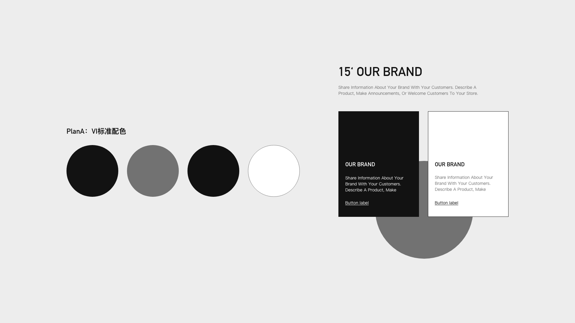

Element refers to a set of visual display collocation standards designed by our visual system, taking the icon as an example, there are linear, fill, 2.5d, static, dynamic and other forms of expression.
Consider responsive + in line with user reading habits, from left to right, top to bottom, and from large to small
Icon design, button design, open screen design, scale application
Dynamic interaction, trigger interaction, feedback interaction, path guided interaction
6.6 Gold 15 seconds re-enabled - Memory Point crafting
|
Conversion, re-purchase, maximize the value of the website and the best transformation, so that users remember
|
A good brand needs to have a brand first impression, it can be color, shape, feeling, Apple advanced, lot cheap, minimalist Mufeng minimalist, Chinese wind China red, group atmosphere, etc., for the website, we need to create the first impression of the website, advanced, atmospheric, white space, large text, c4d picture, interesting buttons and so on. Must be able to bring out the brand feeling, a website only do an excellent highlight can focus on the highlights, so that users can quickly remember the characteristics of the brand.
6.7 Prototype confirmation and effect drawing
|
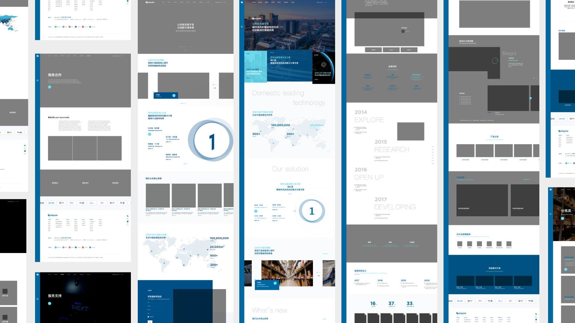
Prototype is an important step of planning landing and user experience combing, through the prototype can quickly plan the content of the page, the relationship between the website pages, simulate the user journey. It should be noted that all planning should be based on the real content that can be provided, and the prototype must be the content that can be landed, so as to ensure the consistency of subsequent implementation.
|
三、Appreciation of excellent cases of PithyMf
Dawn
Quick access to thousands of products
3D dynamic product display

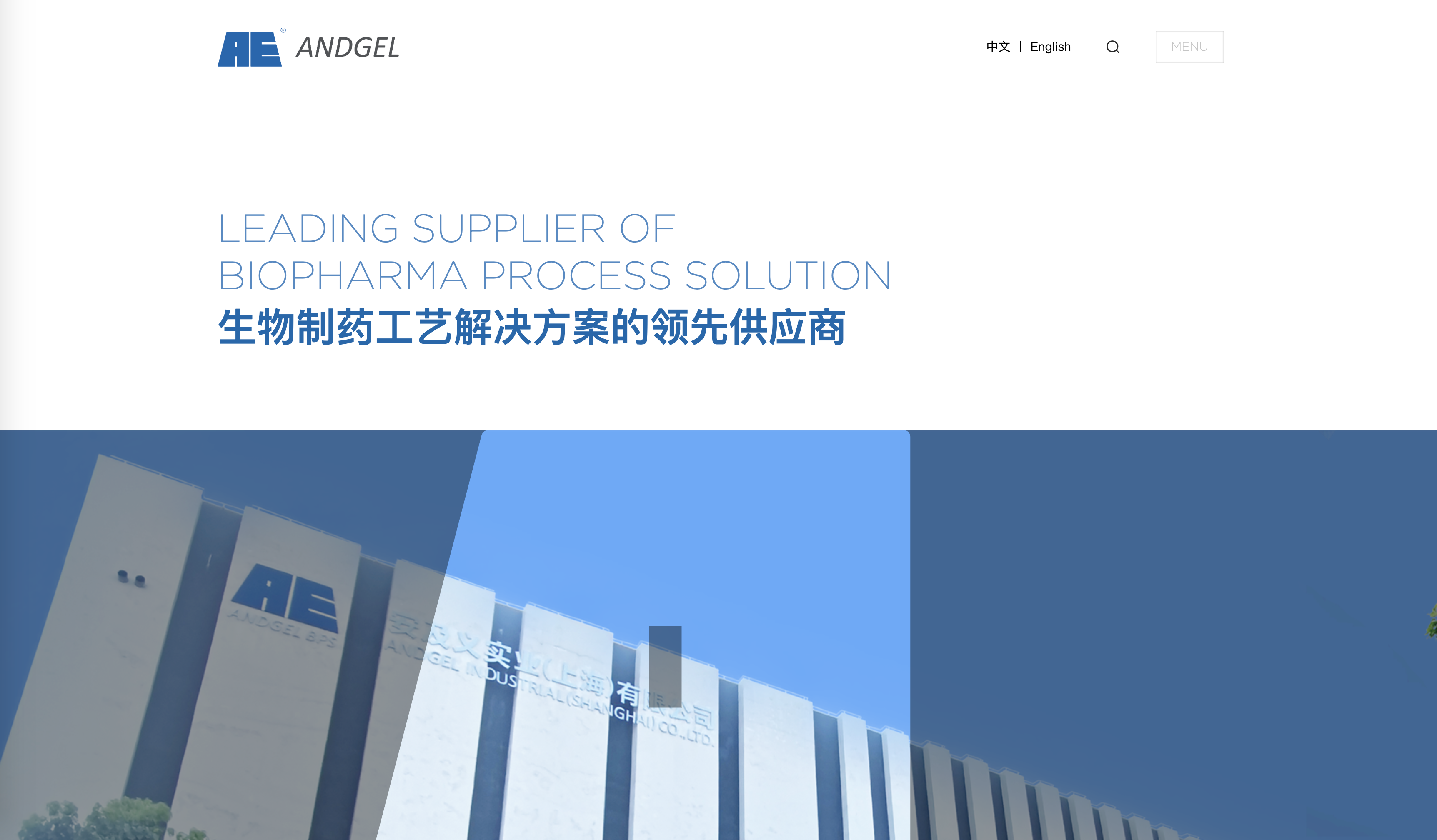
Andgele
First screen large character design
Masked logo triggers movement and strengthens brand visual memory
Feejoy
Product screening and customization
Perfect integration of solution scenarios

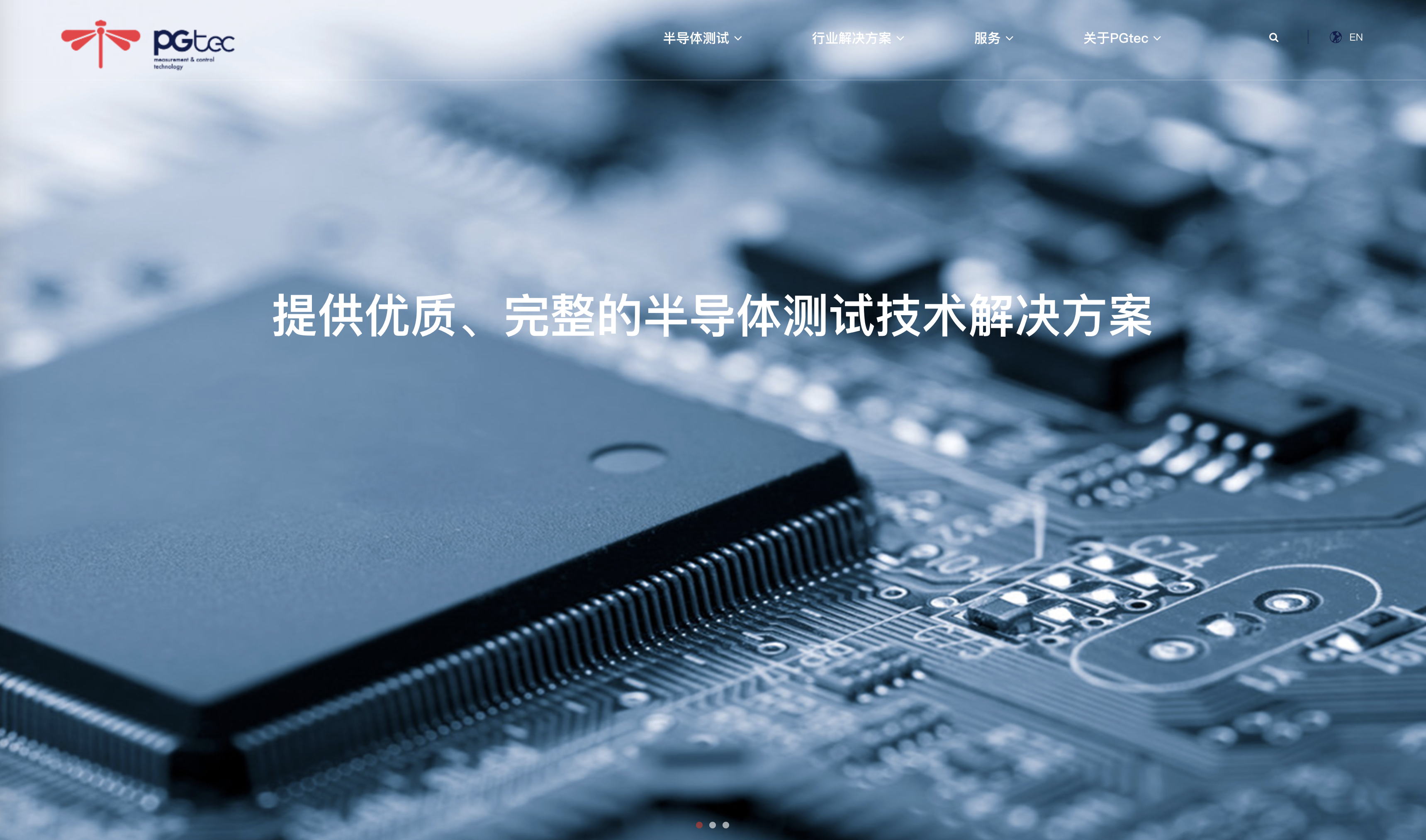
Pgtec
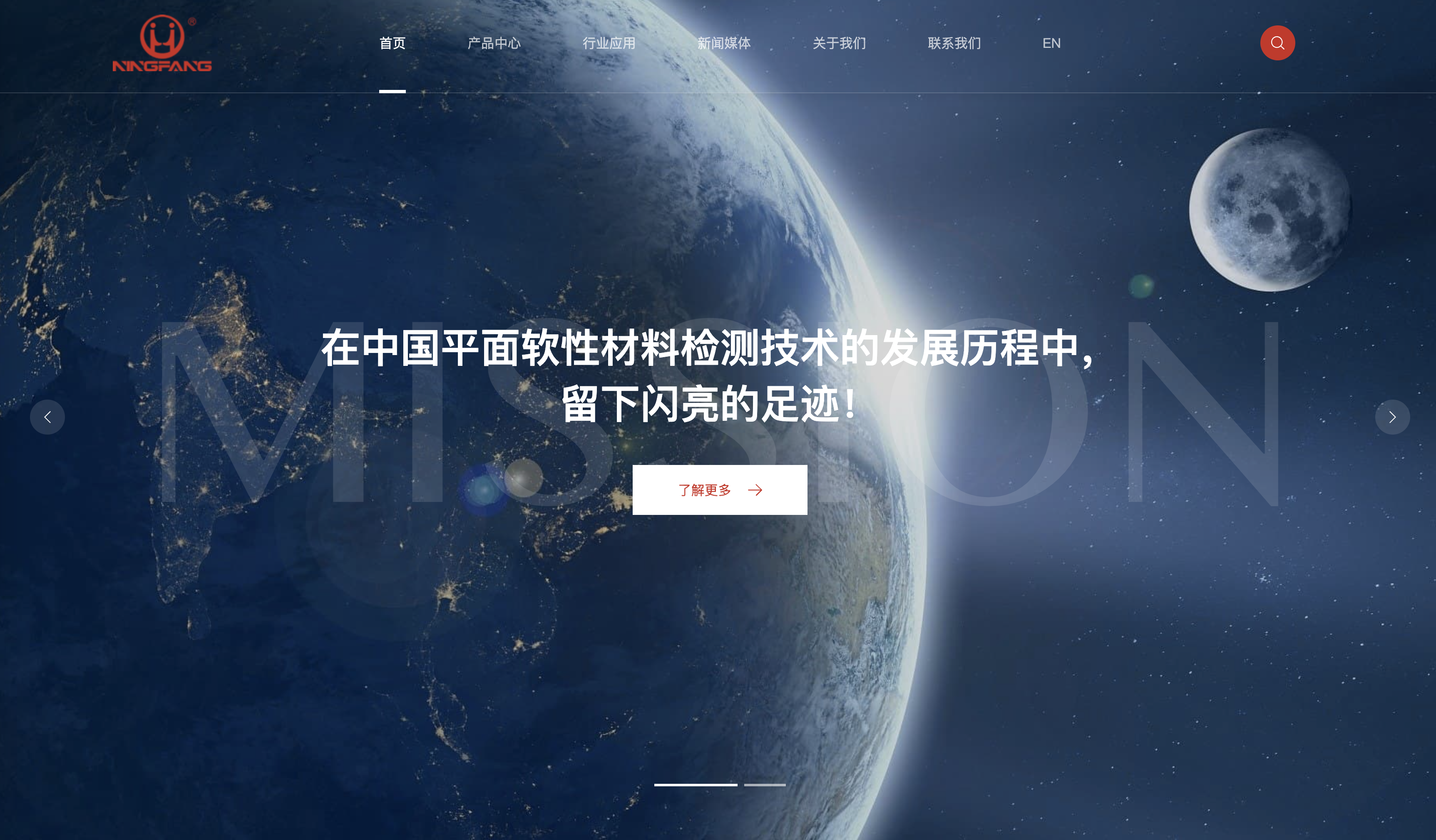
Nb-fy
Aetina

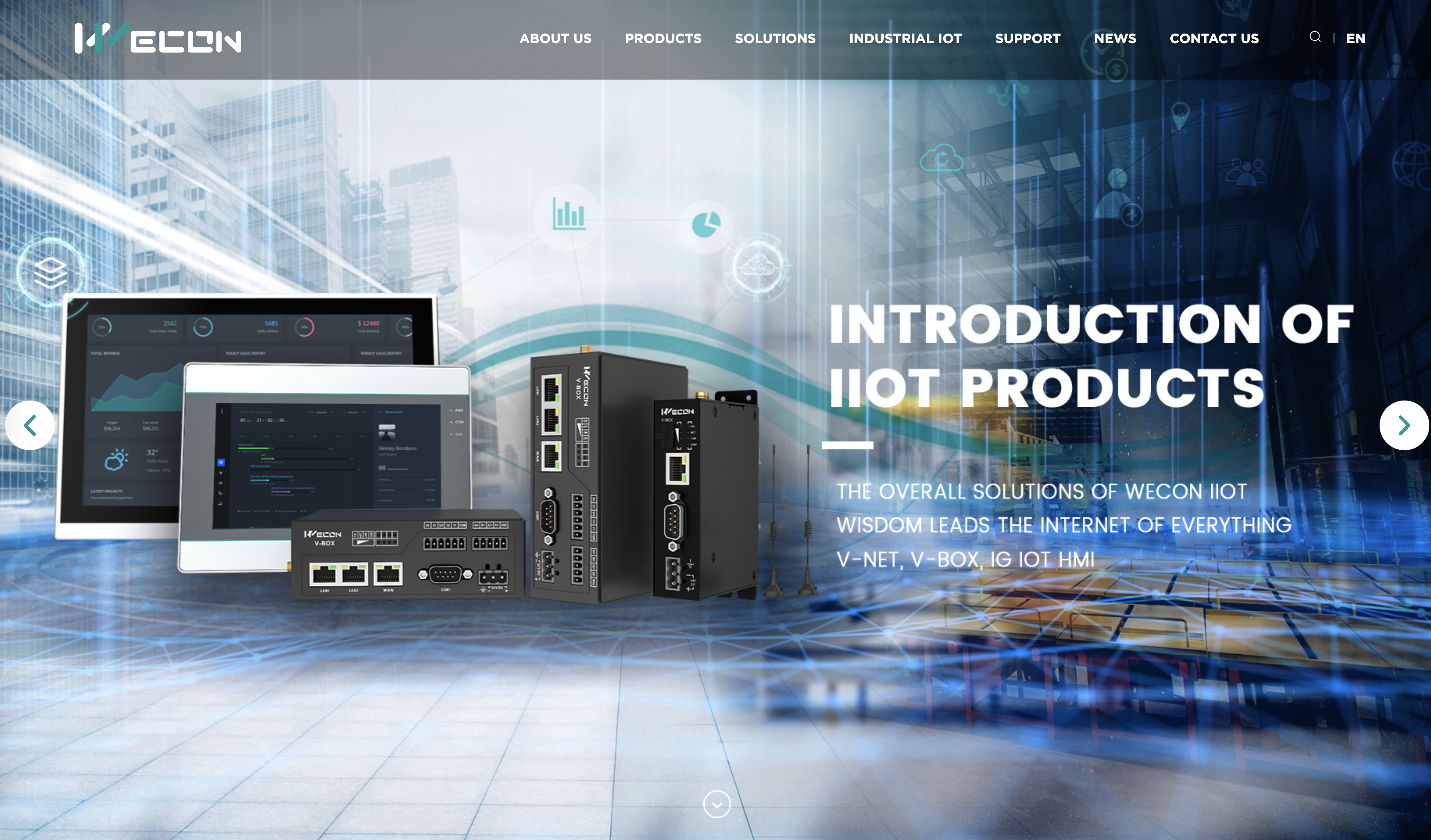
We-con
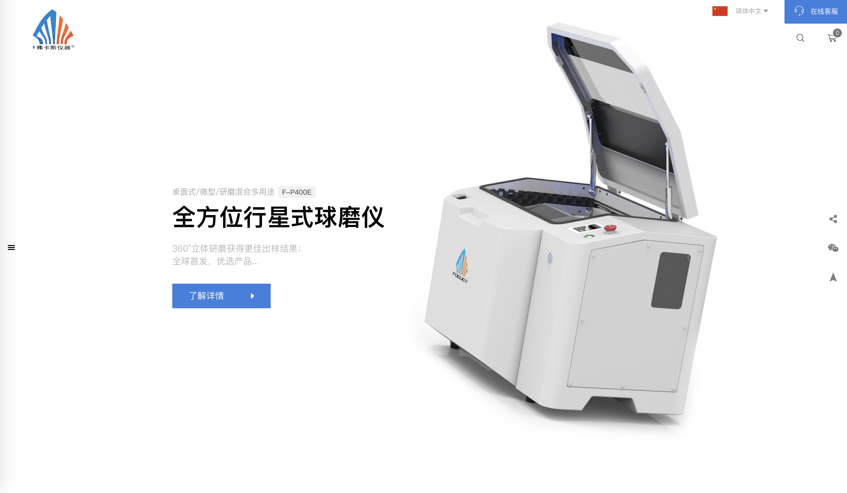
Focucy
AEROTECH
logo as banner
The layout is simple and crisp

Weima
Dynamic and static combination of paper shredder simulation dynamics
One and a half banner guided click design
Rich and capable product layout
Leedarson
High quality video
Simple layout

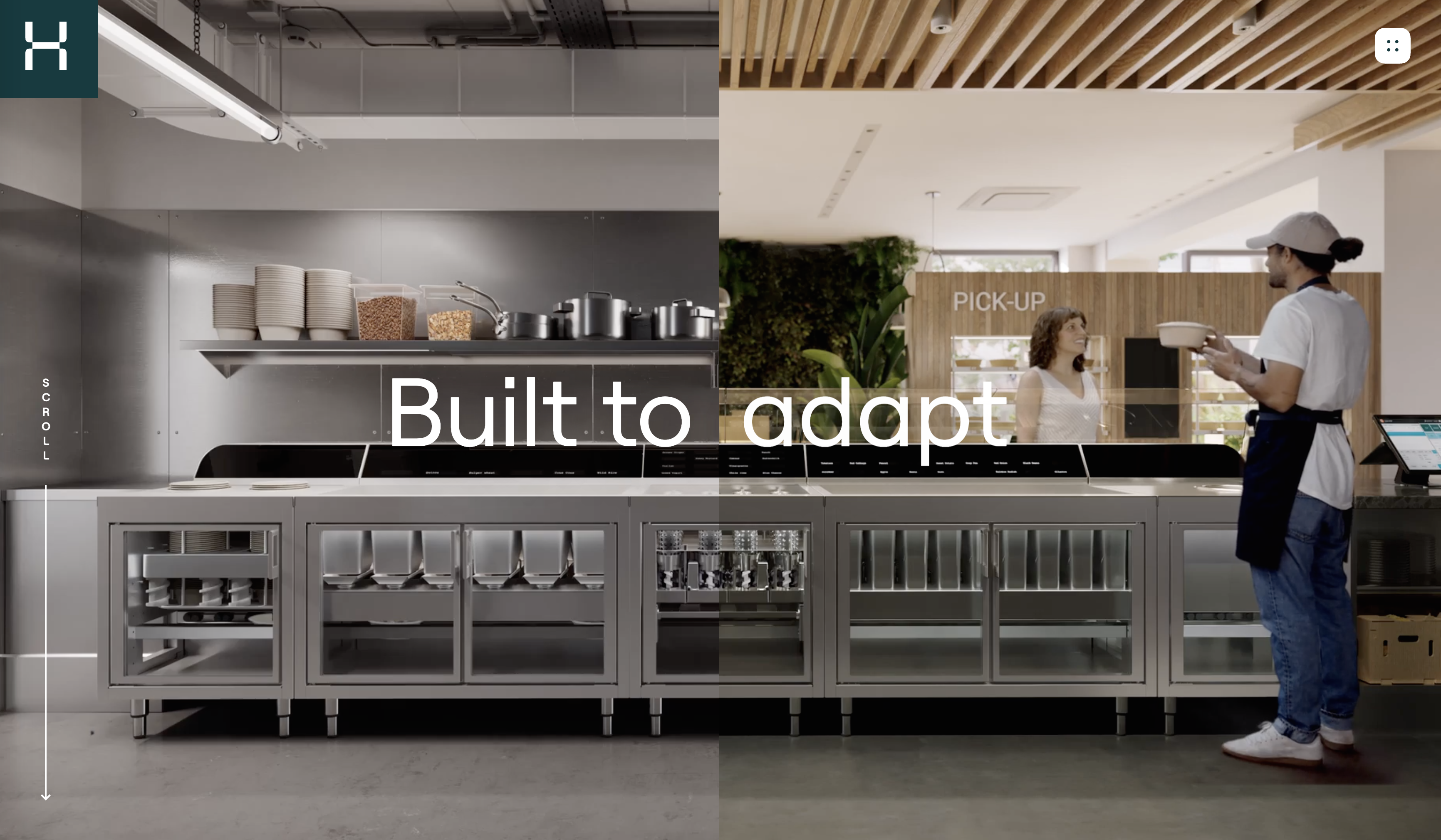
Hyphen
Large block visual impact
High quality process interaction dynamics

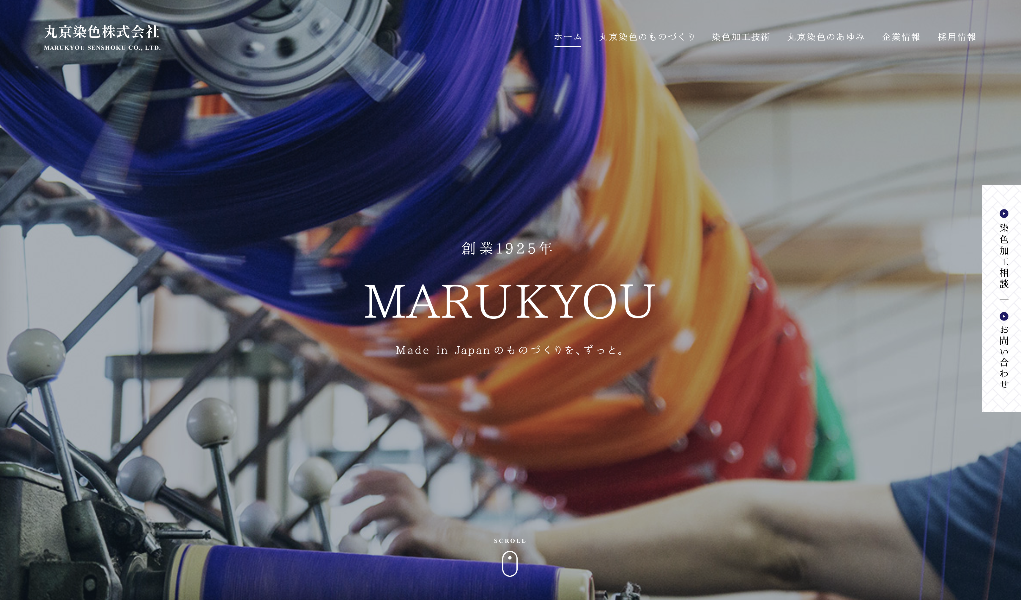
Marukyou-mk
Dynamic color changing banner
https://www.marukyou-mk.co.jp/
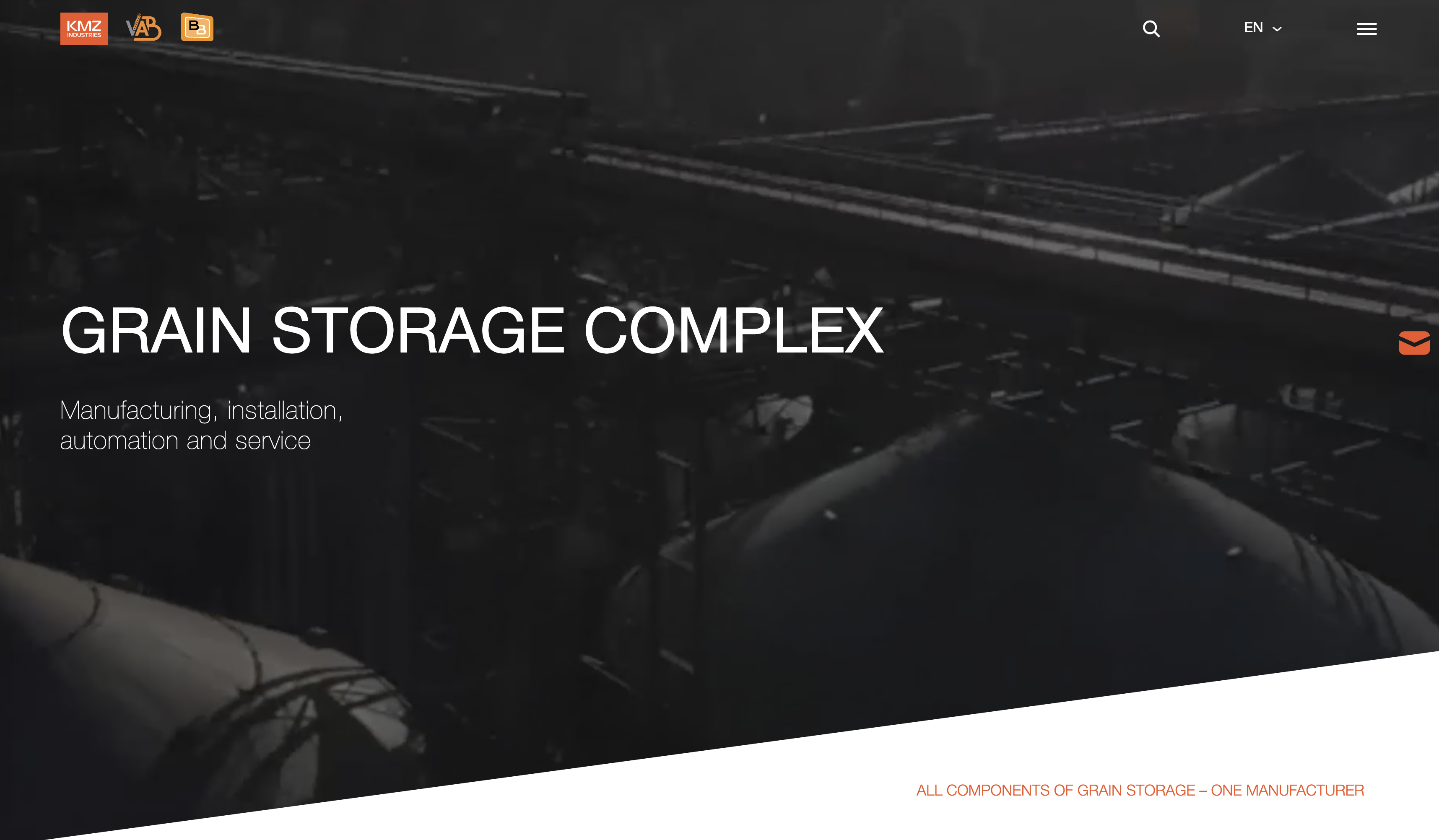
KMZ INDUSTRIES
Oblique visual guidance
Product outline linear svg animation
AKT Oil Services
Large text plus high quality real scene
Scattered but orderly
https://www.aktoilservices.com/

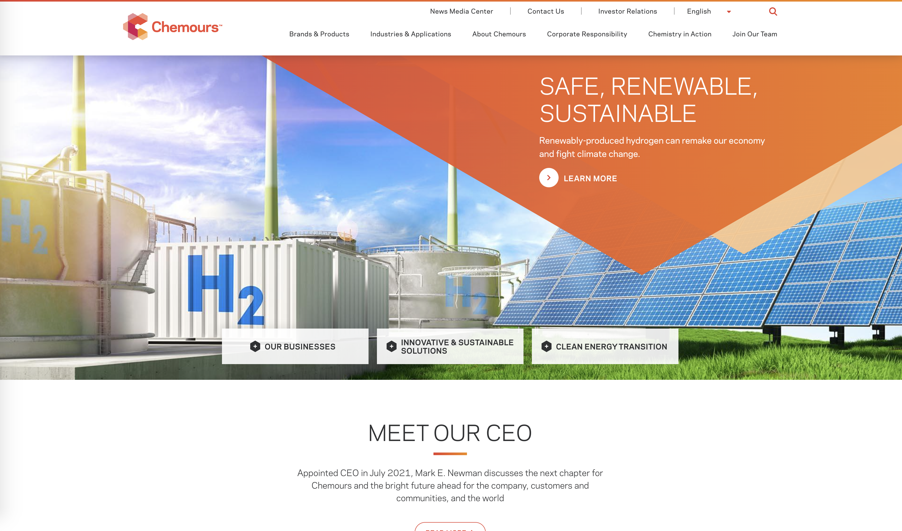
Chemours
Make full use of visual system for interaction design
idstr.jp

MatangiRubbr

SBD AUTOMOTIVE
https://www.sbdautomotive.com/

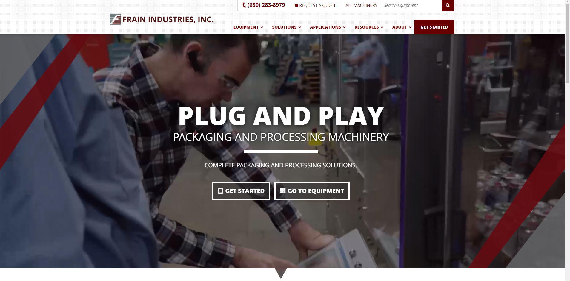
FRAIN INDUSTRIES
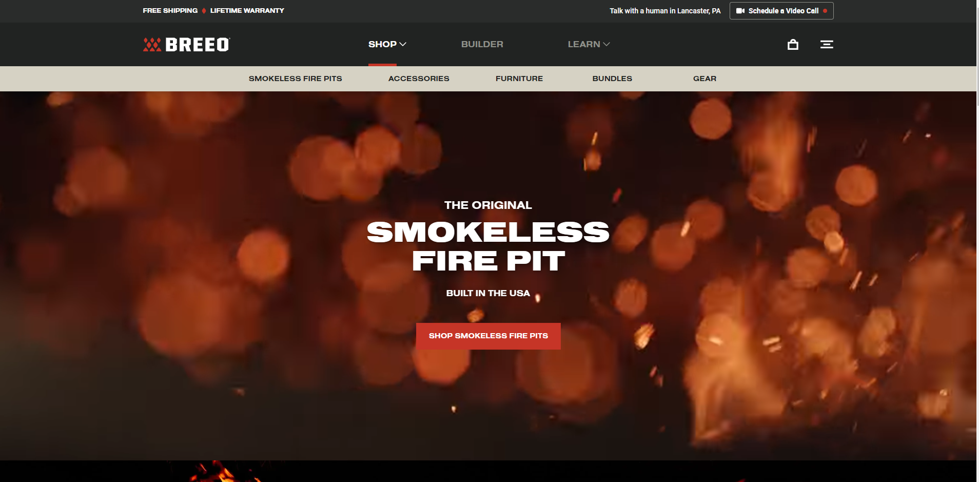
BREEO
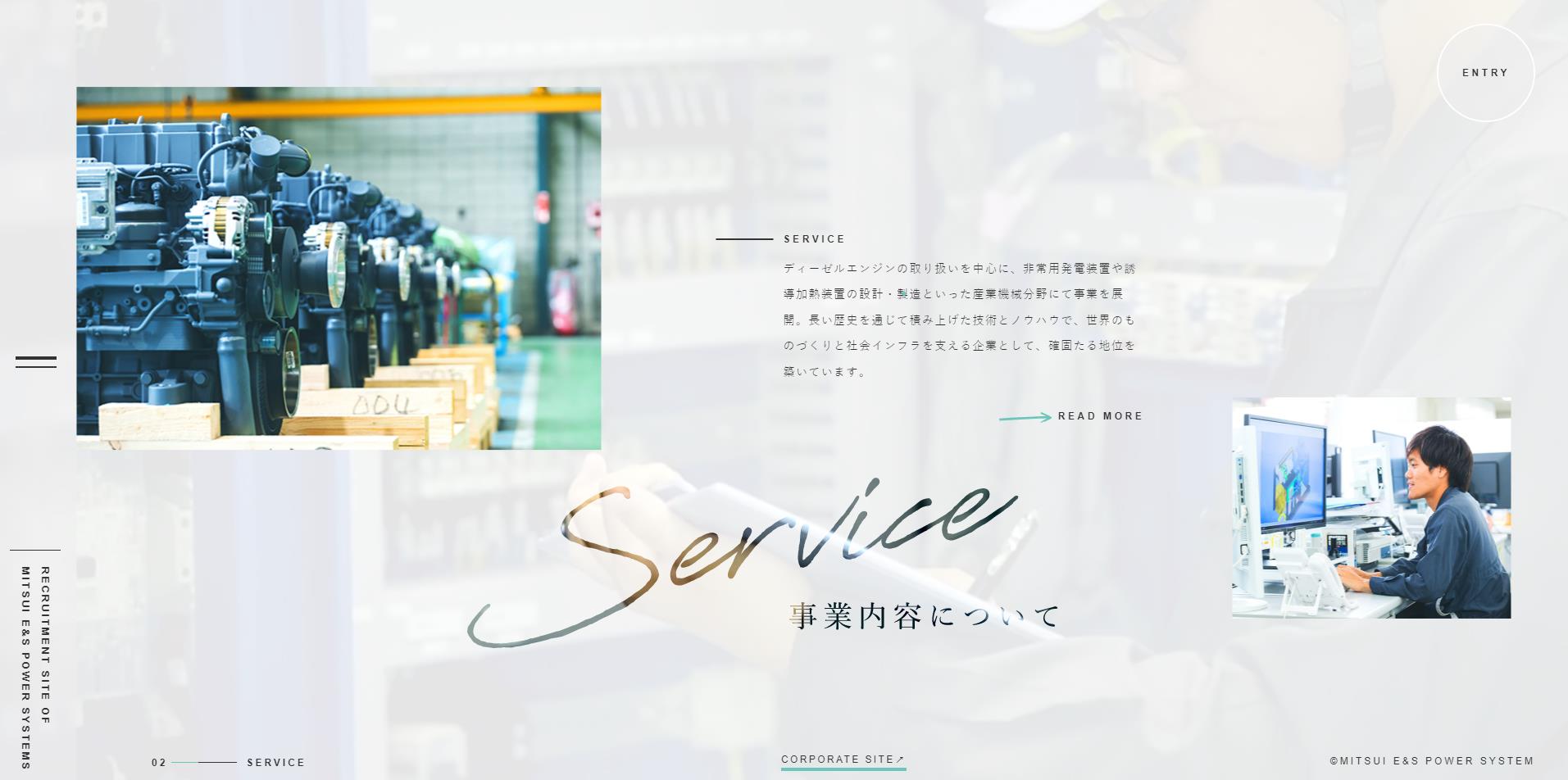
MITSUI E&S POWER SYSTEMS INC.
https://www.mesps.co.jp/recruit/index.html
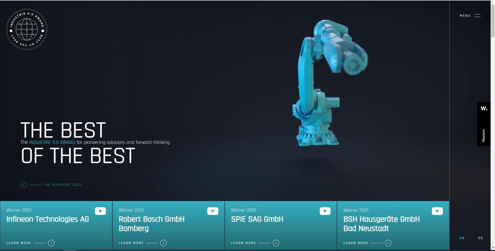
THE INDUSTRY 4.0 AWAR
https://www.industrie40award.com/
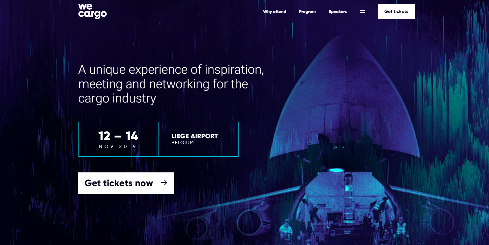
WeCargo
GOOGLE NEST DOORBELL (BATTERY)
BALMUDA
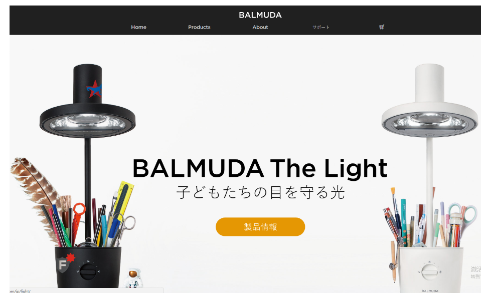
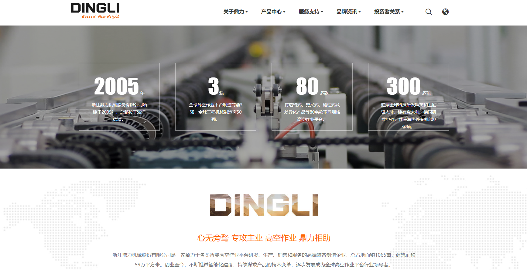
Cndingli
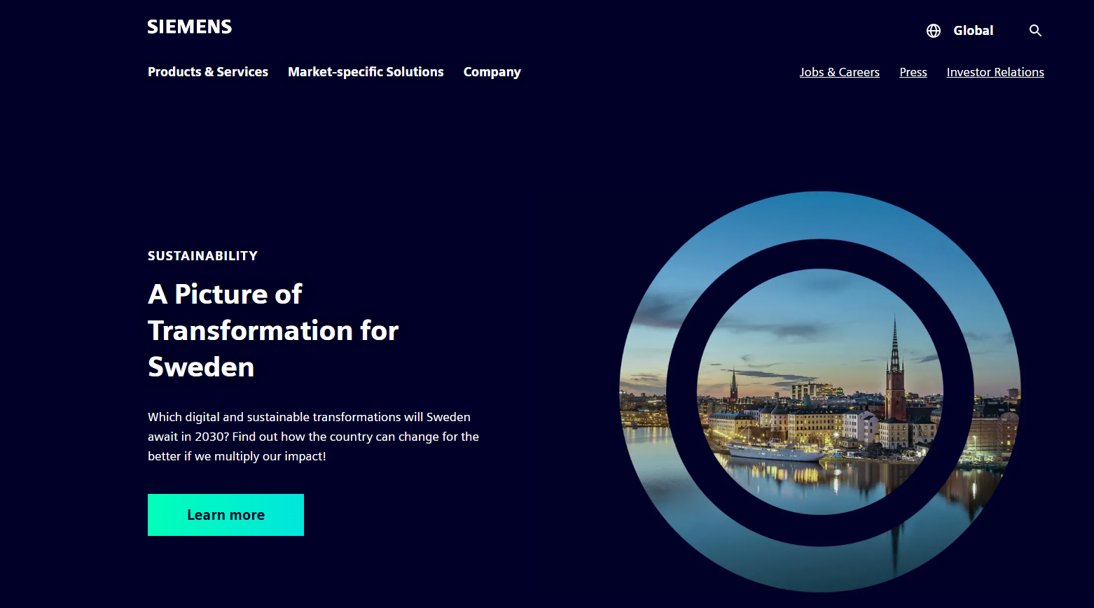
Siemens
https://www.siemens.com/global/en.html
Dürr
https://www.durr-group.com/en/

Methodology
PithyMfweb- Define Business brand website, more methodology please see:
《Official website design must see the user's mental thinking/guide》
《Official website design must see the brand thinking/guide》
《A must-see brainstorm/guide to design》
《Official website design must see color thinking/guide》
《Official website design must see inspiration thinking/guide》
DISCLAIMERS
back to list