Meta Universe · Website design visual design solutions
Share 22 Metacomph + websites and explain Metacomph + related design thinking dissemination steps to understand how Gold 15' is about project landing.
View More

New energy industry station construction solutions, describes the steps of new energy-related design thinking dissemination, understand how gold 15' is to start the project landing.
Body text:
"The new energy industry is an important basis for measuring the level of high-tech development of a country and a region, and it is also the strategic commanding height of a new round of international competition." The use of solar energy, geothermal energy, wind energy, ocean energy, biomass energy and nuclear fusion energy has become the popular name of giant enterprises, photovoltaic power stations, photovoltaic panel components, wind power generation, intelligent energy storage, energy vehicles are our common vocabulary. The style of such website products is very similar, in addition to the product, the solution has become one of the keywords of the website, different use scenarios have become the obvious difference between the enterprise, and the corporate culture, slogan, has become the key to reflect the enterprise product content and scene.
|
The core thinking of building a website from top to bottom allows enterprises to maximize the benefits of the display of Internet platforms.
|
|
The time that the user finds the enterprise website on the Internet, the time that the user stays on the web page, the useful information of the user is transmitted in a limited time, and the user transformation is achieved after a certain time.
|
New energy represents energy saving and emission reduction, environmental protection, nature protection, protection of the earth, full of conceptual corporate slogans emerge in an endless stream, the design of the first screen is particularly important, the combination of enterprise products and their own vision of the banner design is very challenging. The visual impact of the synthetic scene is very strong, such as the following case, the harmonious combination of scene and product directly reflects the strength and level of the company. New energy industry website, the design of the big picture is the most important thing, we need to build a website that can make users remember and recognize the strength of the enterprise in 15 seconds through high-quality picture design.

|
|
|
|
|
|
|
Around the enterprise brand promotion and operation as the core, create brand memory points, express the professionalism of the industry through professional design, and achieve high transformation of the brand website.
|
Enterprises that do new energy have high corporate strength, and for such enterprises to create a complete brand life cycle, corporate mission, vision, and values are essential. Starting from the visual identity system to build our corporate culture identification system, the authoritative endorsement and data display on the website is one of the embodiment of the strength and professionalism of this industry. From the perspective of industry tone, the visual effects of ultra-high definition, simple and clean, large layout and photographic vision can better convey the brand emotion of the industry. In the design of the new energy website, we will build the same logic section, repeat more than three times the same type of visual expression can make people more impressive, in the solution, we take the combination of static and dynamic system embodiment, coupled with the integration of brand visual color data display, as far as possible to integrate the content and brand visual system to create a direct brand sense.
|
|
|
|
|
|
|
We need to cope with the rapid change of the environment, website content synchronization even needs to be ahead of the development of the enterprise, website planning will be combined with the comprehensive consideration of the current and future development of the enterprise, through the precipitation on the Internet, to obtain enough data, to analyze user behavior habits and preferences, to iterate the website and even iterate the product, so as to obtain continuous transformation.
|
New energy, we need to invest, need to develop, need media coverage, we need to continue to output our brand value our corporate strength, the new energy website is more like a business card, in the exhibition, when the bidding is confident to be open, after the user enters the website to deepen their recognition of our strength, and convey the feeling of high-end authority ability. The world's hot new energy, it is recommended that the official website at least Chinese simplified and English two languages, the business thinking of the new energy website, master the flow, transformation, operation of the three core keywords, the official website business card to convey the feeling of strength, the quality solution displayed in the content, coupled with powerful data expression, these are the hard power to promote cooperation. We need to know that traffic can be bought, conversion requires skill, operation requires brains, and we expect the website to achieve its maximum value.

二、Gold 15 seconds landing plan
|
Time thinking - how fast and slow the user lands, long and short
Brand thinking - logic and blocks around the core content
Business thinking - quantitative feedback and iteration
|
1. New energy website features
Based on the same market environment and target groups, we focus on the "tob enterprise" user group, the website needs have certain commonalities.
Mainly in the following four aspects:
Attach importance to enterprise strength display
New energy needs strong corporate strength and research and development technology, we need to combine layout design, visual high-end atmosphere magnificent display to reflect the strength of our enterprise.
Focus on scenario solutions
The application scenario of new energy is a core competitiveness of enterprises, we need to combine products and scenarios to convey the corresponding solutions to users and extend customized services.
Focus on collaboration and scale
The scale and quantity and the energy saving benefits generated are an important reflection of the strength of the enterprise, and we need to consider the visual impact of the benefits brought by the solution when we present the solution.
Differentiated experience
Conceptual picture design is a core of the new energy website, because of the particularity of the product and the sense of mission, we can properly through some interactions, such as the dynamic mode of the implementation of the solution, to visually show the user professionalism, and then combined with the brand vision system to bring users different experience and memory points.
What we call corporate positioning refers to the scale of the enterprise in the industry, such as listed groups, well-known enterprises in the industry, the world's top 500, China's top 500, or the competitive advantage in a certain circle, start-ups, etc., with corporate positioning, we can get the target group and audience size, and the design of unique space, so that the website presentation makes it recognized by more people.
Combine the solutions provided by the enterprise
Industrial and commercial distribution power station, household distribution power station, centralized ground power station...
Off-grid system solutions, integrated energy management solutions...
Components, transformers...
Combine enterprise industry positioning/expectations
|
Giant industries, innovative industries, manufacturers, distributors, partners
|
We emphasize the development of enterprises, Internet information transmission can give priority to the appearance of the future development of enterprises, create well-known brands, focus on small circles, large foreign trade, domestic wholesale huge online sales network, etc., we can combine the future planning of enterprises, reserve section location and data interface.
Combined with enterprise industry positioning/expectations:
Manufacturers, custom requirements, government agencies, suppliers
|
Short term promotion/medium term empowerment/long term precipitation
|
Short term promotion/medium term empowerment/long term precipitation
2.3 Competitive product research
|
The analysis of competitive products we do is not only the parallel competitive products of customer enterprises, but also the analysis of high-quality page views and websites with high conversion rates. We will analyze the commonalities of these columns and get the best reading method and layout presentation method for user behaviors. |
For new energy websites, it is more about solutions and customized needs, and the display of cases and scales is essential. We need to emphasize the user's behavior habits and ultimate purpose, which can make the user land more quickly generated conversion, to avoid the unimaginative thereby consuming the user's residence time.
3. Website content arrangement and column planning
|
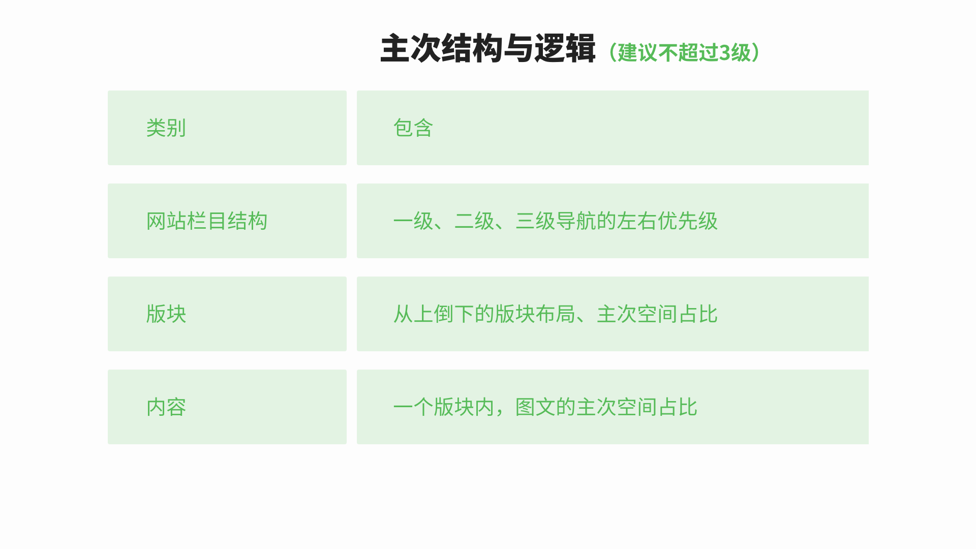
Raw data ➡️ classification and collation ➡️ primary and secondary structure and visual priority logic ➡️ section presented
|
In the section planning of such enterprises, the solution is generally the first place, combined with the actual data and resources of the enterprise, we supplement and complete columns such as investor information and cases.
4. Gold 15 second design point
Extract and sort out the conclusions of demand analysis and competitive product analysis, so as to efficiently capture design points and create brand visual points through divergent thinking.
By integrating the advantages of competitive products and bringing inspiration, we need to take their essence, combined with our own products through the design of further brand support.
Try to avoid making "common sense" mistakes, such as using simple button navigation in a multi-category navigation design, by describing the shortcomings of competing products and the opportunities of your own products.
We will combine the golden 15 'design key points to help you determine the overall visual goals of the website, behavioral goals, interactive goals, brand goals, so that users quickly land, in the limited time to browse the web to generate active user information. We will acquire customers in real time through convenient online conversations and convenient form messages, and create space for customer stickiness by creating private traffic.
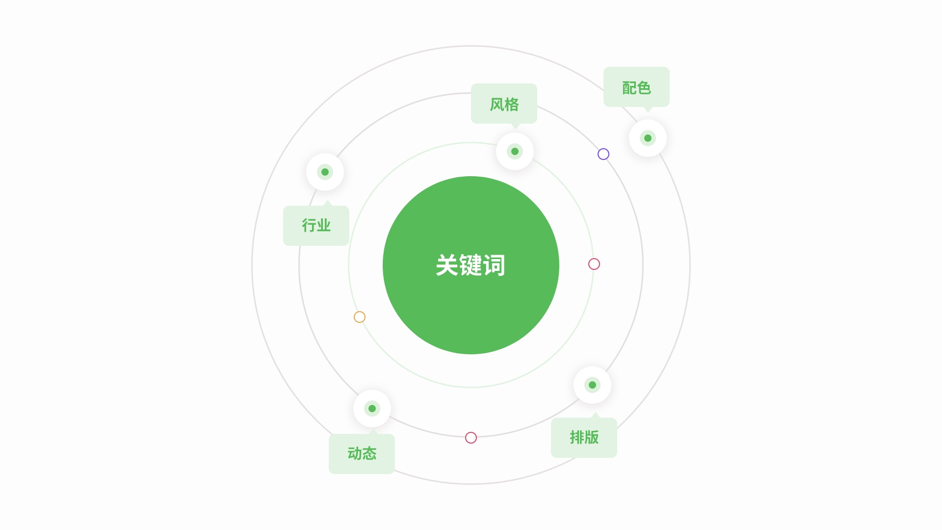
For example: Take a new energy as an example, we brainstorm as many words related to enterprises, industries, products and users as possible (these keywords are required, see Note 1 for details), atmosphere, scale, government, components, solar panels, green, natural, environmental protection, energy saving, solutions, etc. Through overlay, superposition to select the final visual presentation of the vocabulary as the project's design benchmark and creative distribution starting point, this may only have one keyword, there may be many, but the principle is that they do not repeat, no intersection, for example, Ouda's keywords for the brand visual elements application, large screen, simple.
Then through the user's "mental model" analysis of user behavior psychology, authority, trust, field, long-term partners, to improve the design board.
Our design is never hard work, website design needs commercial, business needs market verification, we need to sort out a large number of websites to quickly get inspired, follow a few principles to find inspiration, according to the "positioning", "target words", "mental model" based on mass search, and through ① collection; ② Extraction; Repeat 1 and 2 to maximize input and output.
|
ps:We will meet some customers, feel that there is nothing to change, but it is to change, we can be sure that the minimalist maple design inspiration is not less than yours, I believe that we will use the right enterprise and the right target user design form.
|
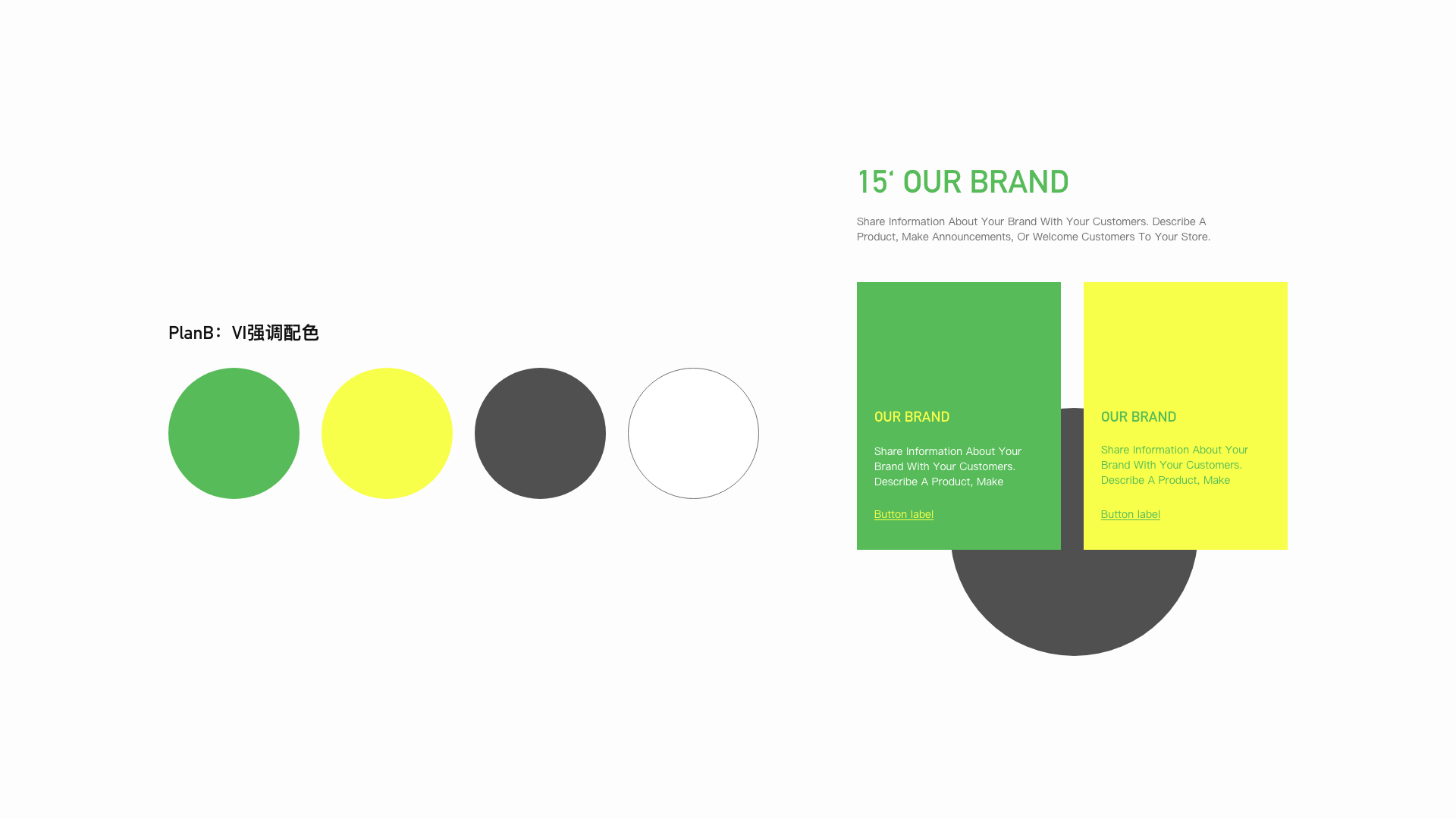
Many companies we contact do not have a complete VI manual, but only a logo. We need to continue and expand the color proportion of the website according to the existing Vi manual or a simple logo. A single-tone logo does not mean that the web page only uses the main color plus black, white and gray, but needs to match with auxiliary colors. Design a visual effect with active vitality that can form the first feeling of the brand.

Element refers to a set of visual display collocation standards designed by our visual system, taking the icon as an example, there are linear, fill, 2.5d, static, dynamic and other forms of expression.
Consider responsive + in line with user reading habits, from left to right, top to bottom, and from large to small
Icon design, button design, open screen design, scale application
Dynamic interaction, trigger interaction, feedback interaction, path guided interaction
6.6 Gold 15 seconds re-enabled - Memory Point crafting
|
Conversion, re-purchase, maximize the value of the website and the best transformation, so that users remember
|
A good brand needs to have a brand first impression, it can be color, shape, feeling, Apple advanced, lot cheap, minimalist Mufeng minimalist, Chinese wind China red, group atmosphere, etc., for the website, we need to create the first impression of the website, advanced, atmospheric, white space, large text, c4d picture, interesting buttons and so on. Must be able to bring out the brand feeling, a website only do an excellent highlight can focus on the highlights, so that users can quickly remember the characteristics of the brand.
6.7 Prototype confirmation and effect drawing
|
Prototype is an important step of planning landing and user experience combing, through the prototype can quickly plan the content of the page, the relationship between the website pages, simulate the user journey. It should be noted that all planning should be based on the real content that can be provided, and the prototype must be the content that can be landed, so as to ensure the consistency of subsequent implementation.
|
三、Appreciation of excellent cases of PithyMf
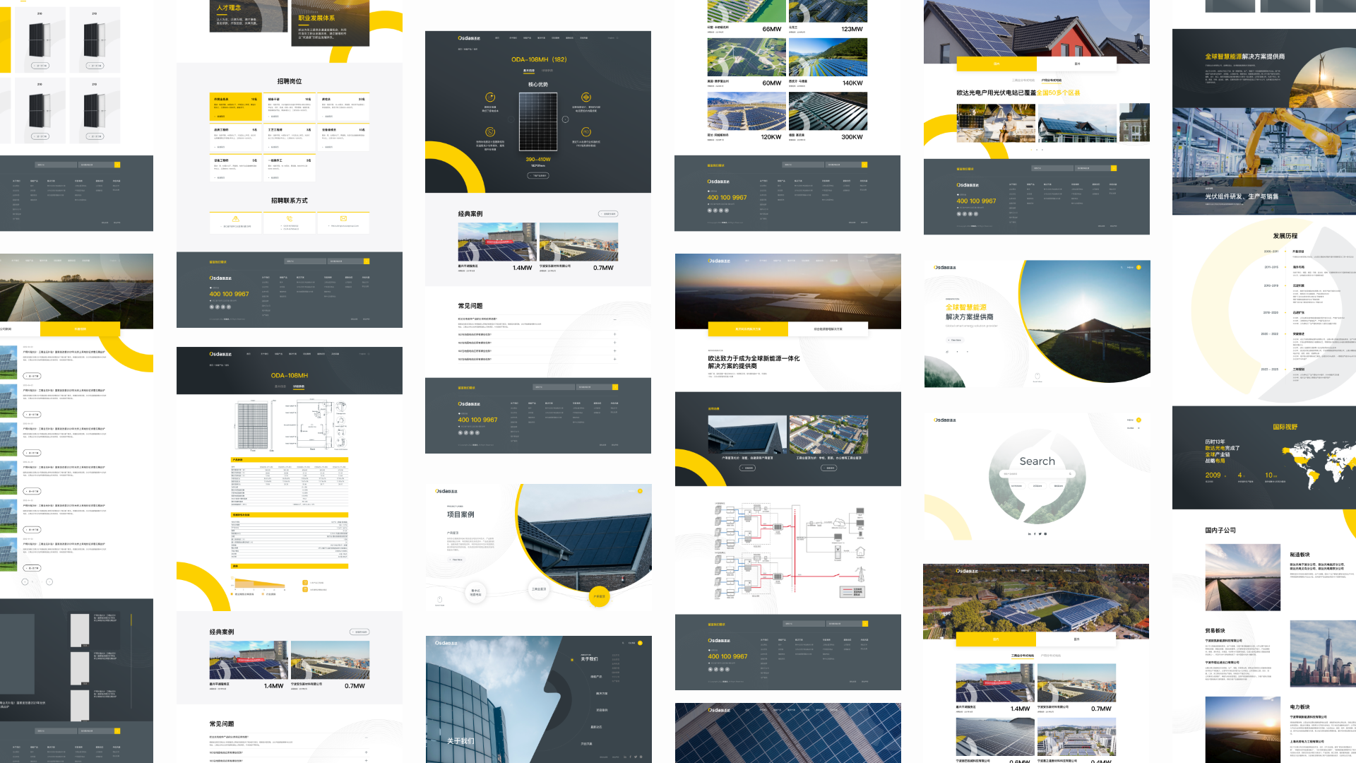
Osdasol

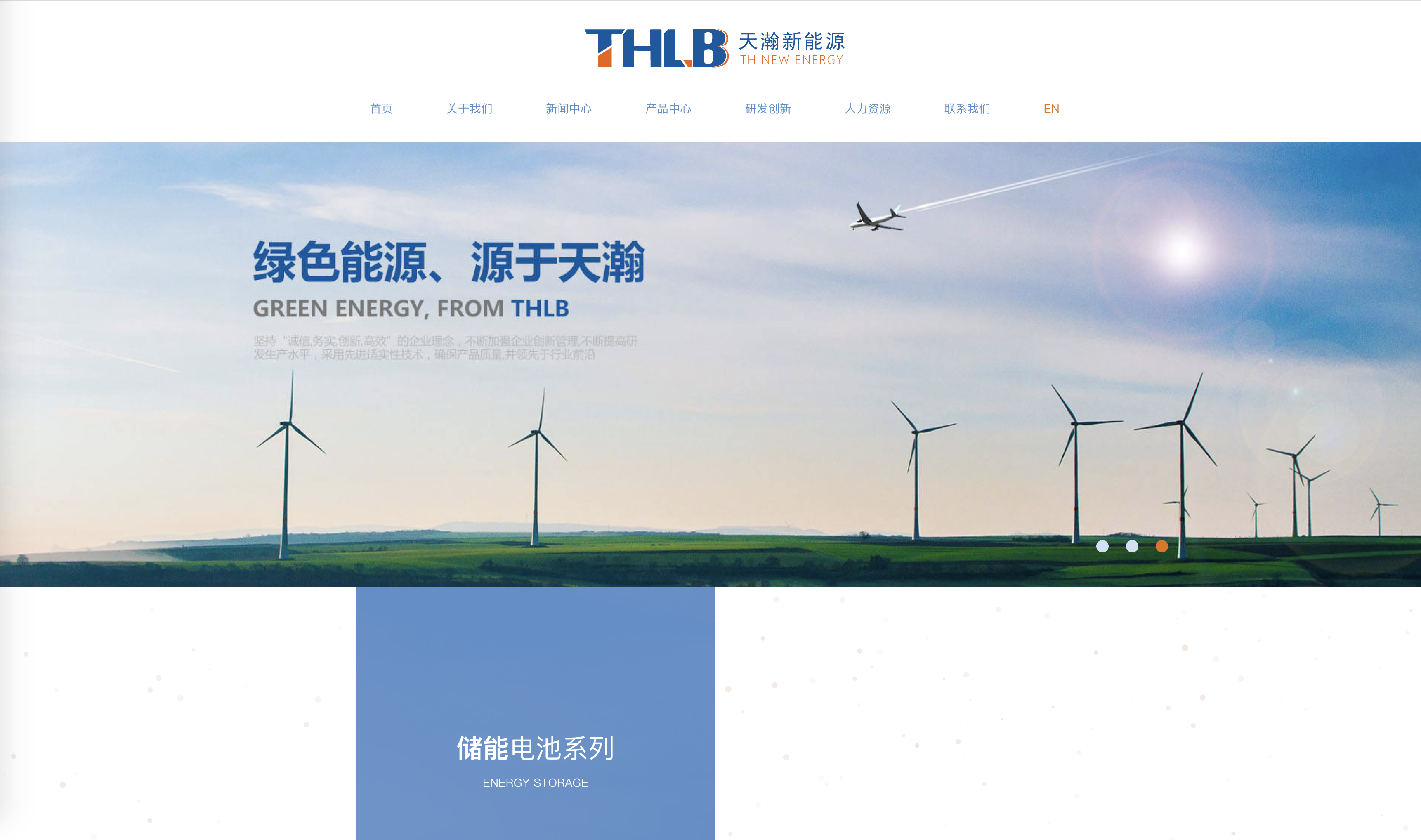
Thbattery
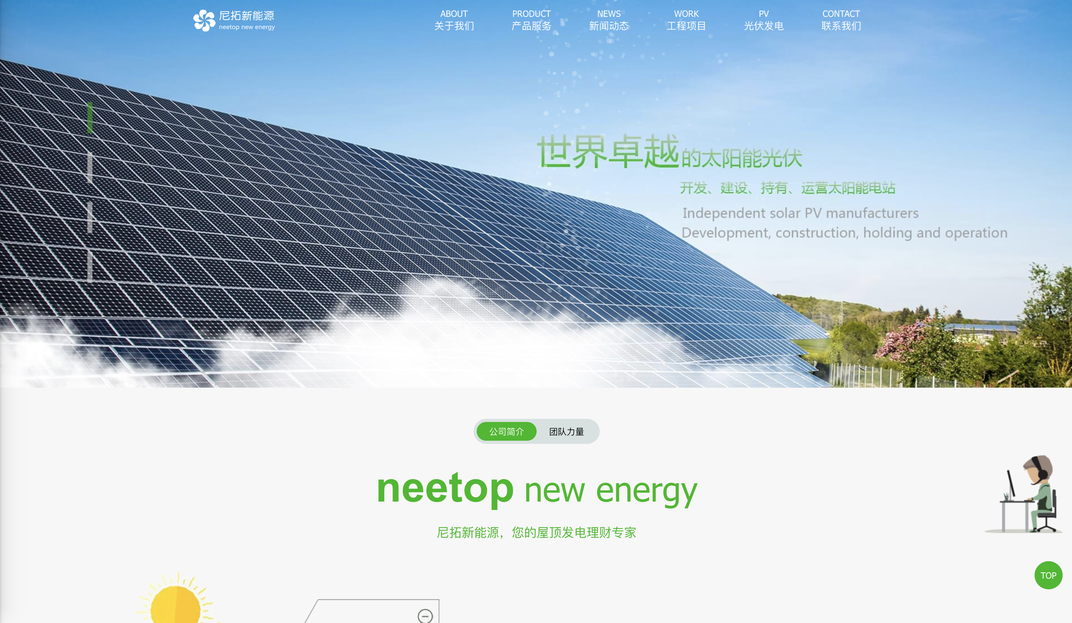
Nituo
Viwang is in harmony

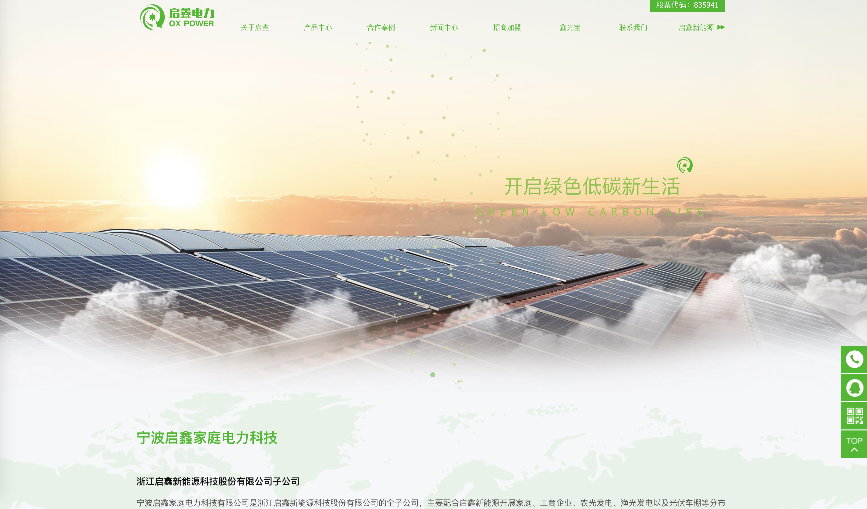
Qixin home power
http://qixin.mfweb.club/index.php
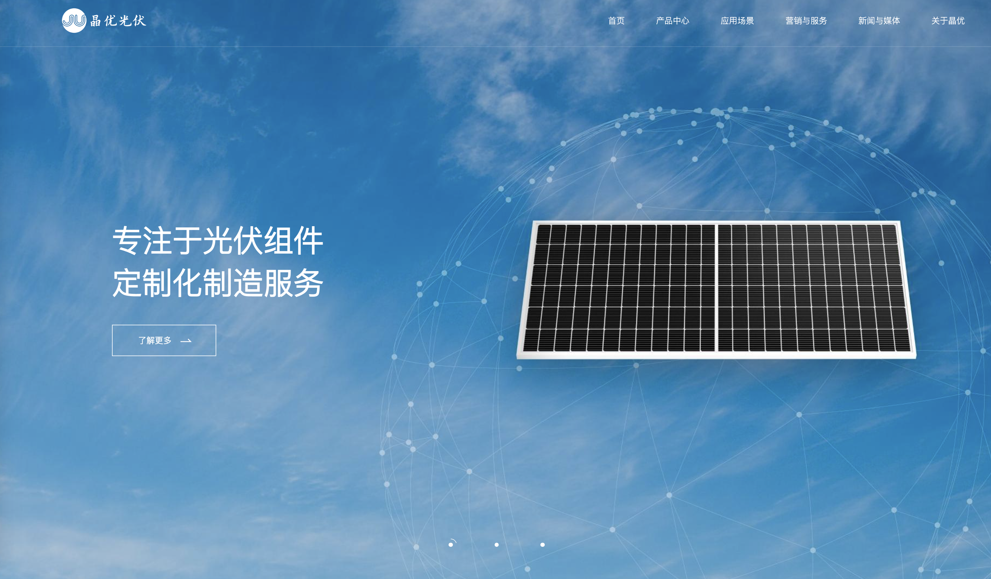
JingyouPV
Envision
https://www.envision-group.com/cn/index.html

Goldwind

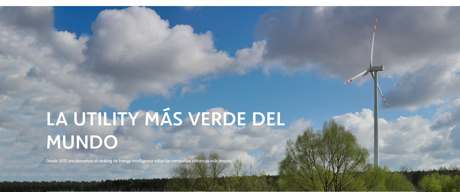
Acciona Energy technology company
https://www.acciona-energia.com/es/?_adin=01566437379
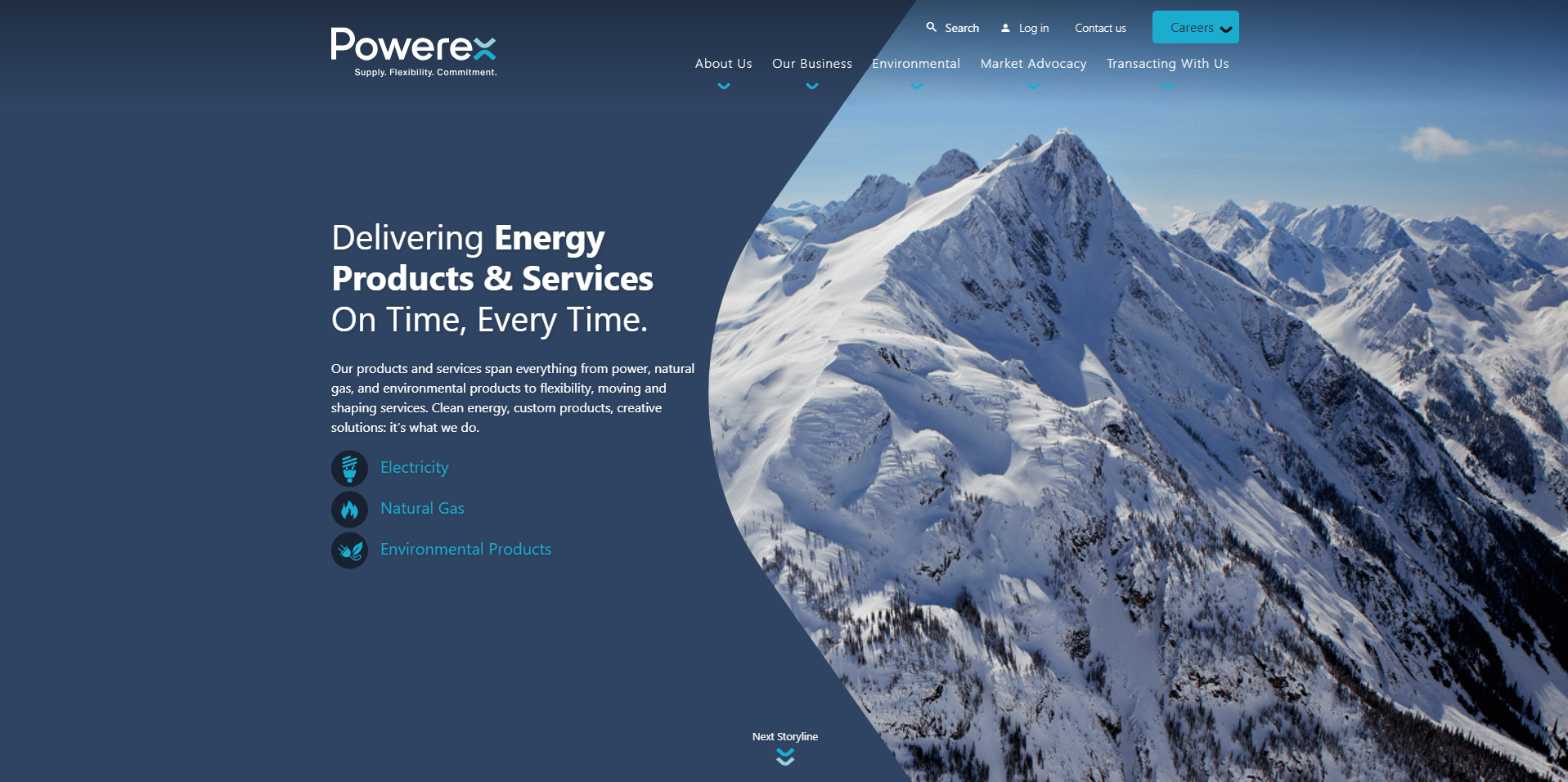
Powerex
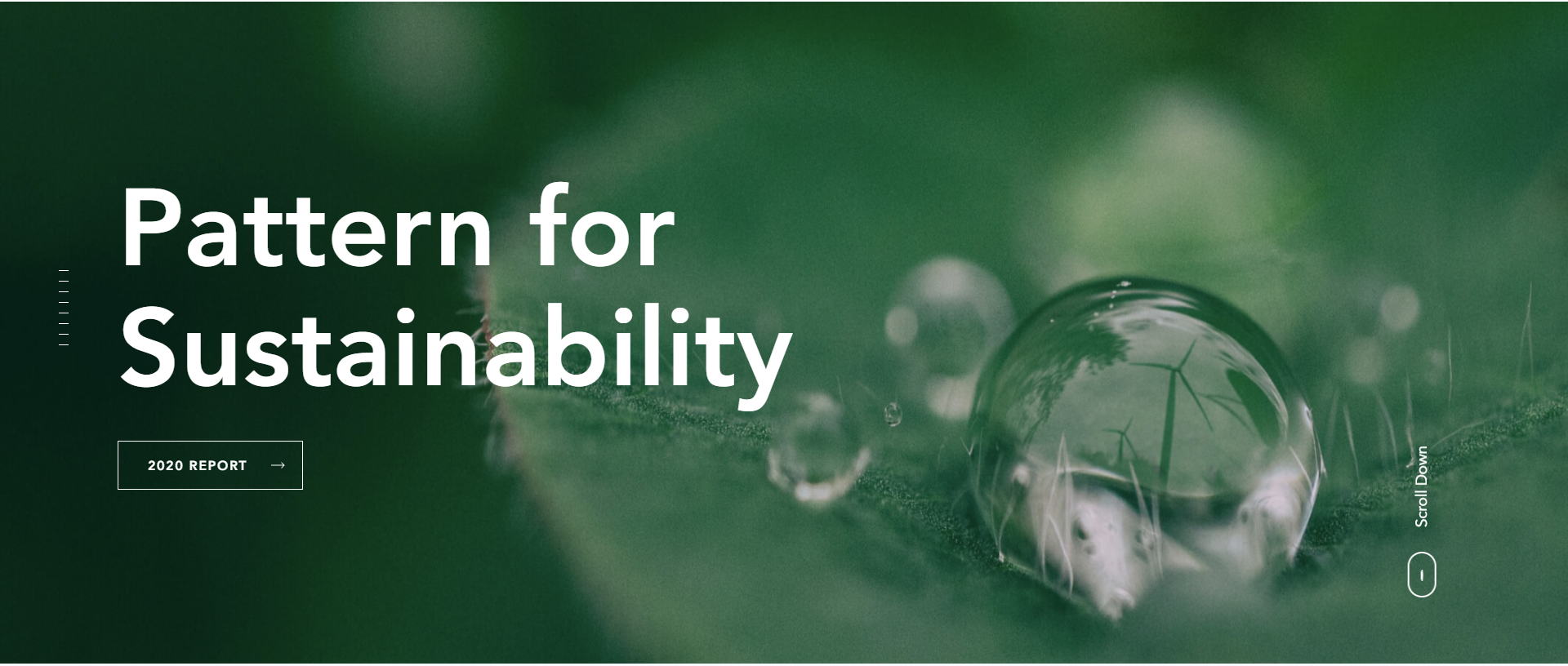
Pattern Energy
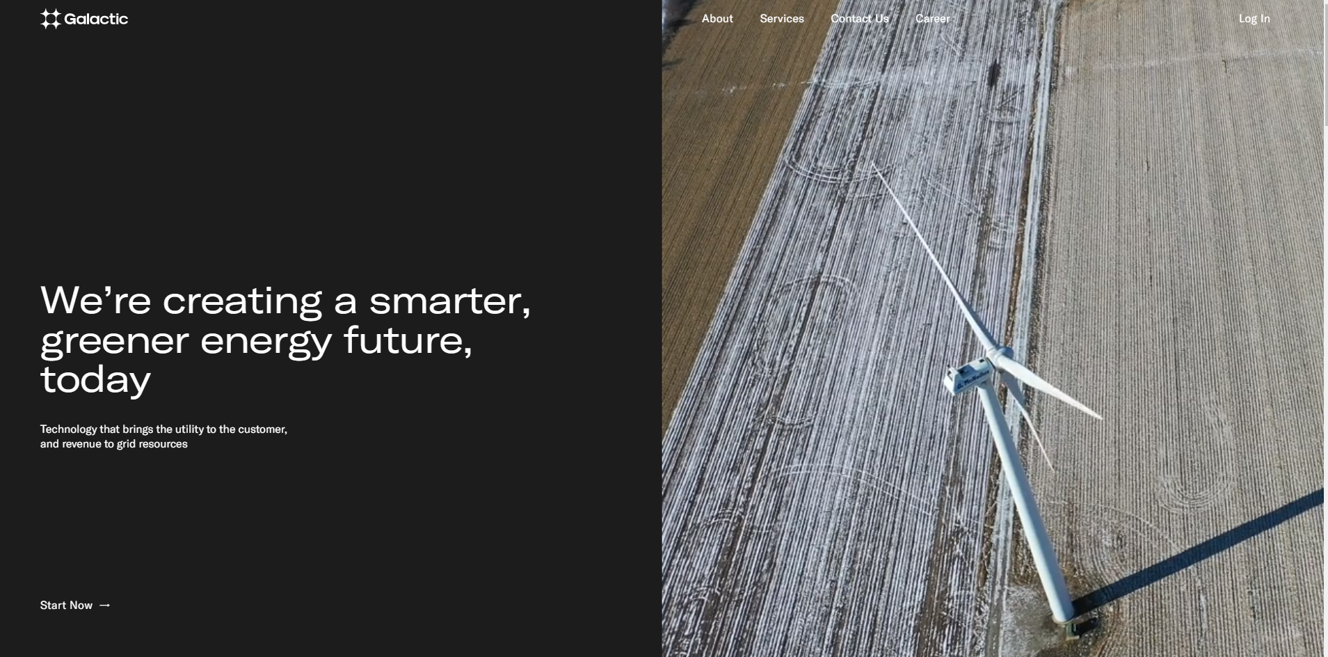
GALACTIC ENERGY
https://www.galacticenergy.com/
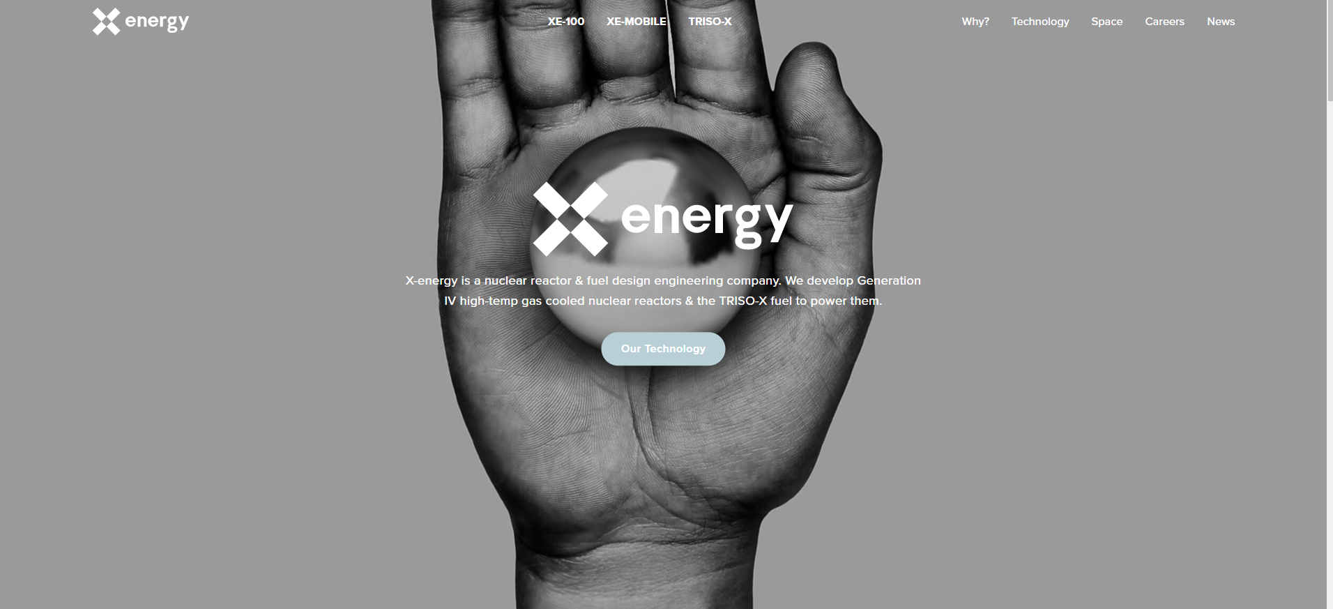
X-energy

TES H2 GREEN CYCLE EXPERIENCE

vadiMAP

Brookfield Renewable U.S.
https://brookfieldrenewableus.com/

Air Company
https://www.aircompany.com/technology/

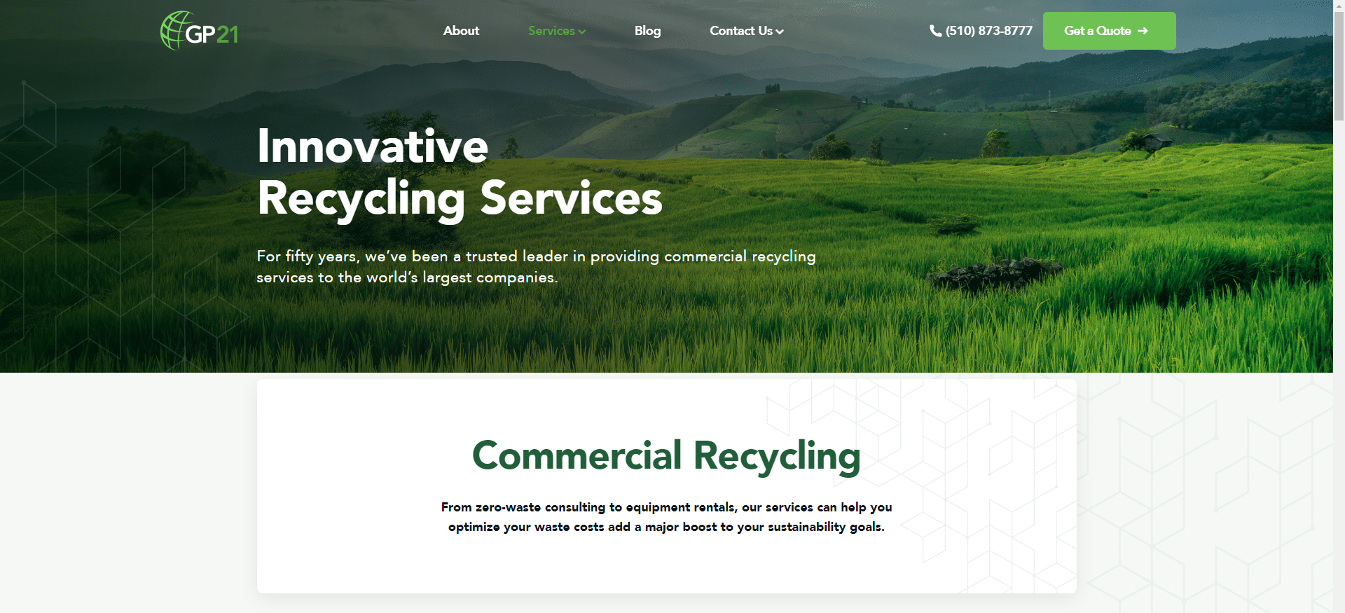
GREEN PLANET 21
GREEN ASSETS WALLET

SENEC-LUŽIANKY

Methodology
PithyMfweb- Define Business brand website, more methodology please see:
《Official website design must see the user's mental thinking/guide》
《Official website design must see the brand thinking/guide》
《A must-see brainstorm/guide to design》
《Official website design must see color thinking/guide》
《Official website design must see inspiration thinking/guide》
DISCLAIMERS
back to list