Body text:
In the past decade, the import and export volume of China's trade in goods has reached a new high, and China has become the first country in the world's trade in goods. With the upgrading of unmanned and intelligent, coupled with the increasing degree of refinement of the user group, the brand awareness is becoming stronger and stronger, enterprises are increasingly concerned about their image and product transactions on the Internet, and more subtraction or transformation from the horizontal field or a category to do vertical fields and subdivisions. With the constant fluctuation of sales commission, advertising bidding and logistics costs of cross-border e-commerce platforms such as Amazon, Aliexpress and eBay, more and more foreign trade enterprises choose to build their own Internet sales channels in the form of independent stations. Here, our solution first Outlines the broad categories of trade products, and then we will share different products from cross-border e-commerce, domestic trade and different industries.
一、Three thoughts
|
The core thinking of building a website from top to bottom allows enterprises to maximize the benefits of the display of Internet platforms.
|
1. Temporal thinking
|
The time that the user finds the enterprise website on the Internet, the time that the user stays on the web page, the useful information of the user is transmitted in a limited time, and the user transformation is achieved after a certain time.
|
When users enter a product website, we need to grasp the first element: buying something. The difference between a professional product website and a brand station is that the brand can spend time interacting and spending time to show the content to customers, but the core of the product website is to sell things, all content around the product display as the core to unfold, hot, latest, recommendation, after-sales, endorsement are important planning of the website. First do not talk about the logical structure of the product, in the home page, what kind of product display form is the most attractive to users, what kind of product display can reflect their selling points, how to quickly guide customer inquiries or orders are all points we need to consider.
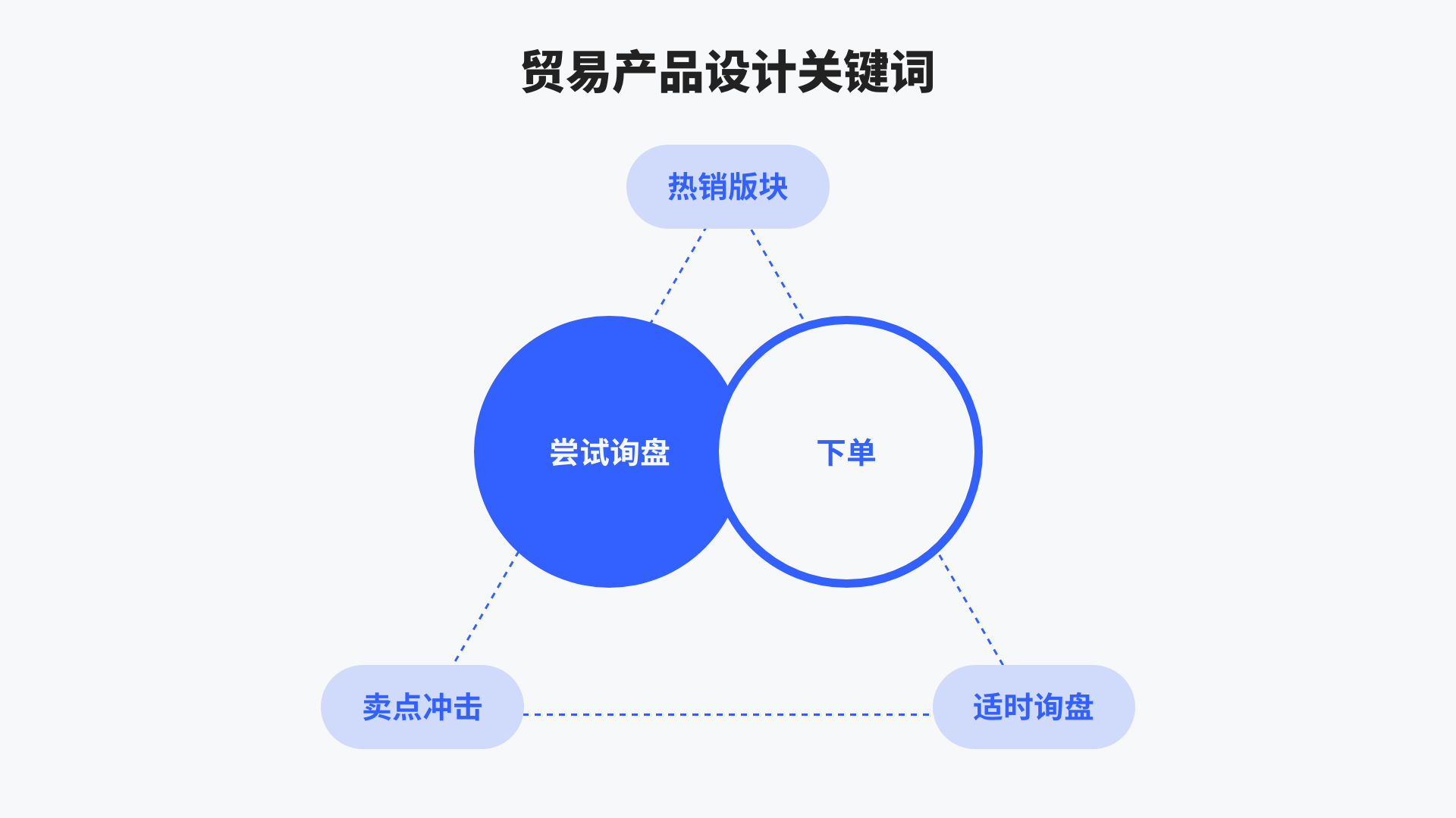
According to the needs of target users, we need to draw up hot sales, selling points, inquiries and other sections combined with high-quality visual design, to build a website that allows users to try inquiries or orders within 15 seconds.

2. Brand thinking
|
Around the enterprise brand promotion and operation as the core, create brand memory points, express the professionalism of the industry through professional design, and achieve high transformation of the brand website.
|
We have seen too many product websites, most of the structure is banner, popular, recommended, product categories, services, the logic is almost the same, not to mention the enterprise's products need to have their own brand characteristics, in the planning of the website, we hope in the color, layout layout, font, element use, can let people feel the enterprise's own brand tonality at a glance. We mentioned earlier the "mental model", which is our method and habit of understanding things, starting from the most primitive and simple product list, and constantly giving emotional colors, stripes, color blocks, color, monochrome, linear, filling, serif and non-serif, dislocation and regular layout, various proportions of pictures, We need to use appropriate display techniques for this website from a brand perspective.
(⬇️allbirds.com Young brand using high-saturation products, color collocation is very beautiful)

3. Business thinking
|
We need to cope with the rapid change of the environment, website content synchronization even needs to be ahead of the development of the enterprise, website planning will be combined with the comprehensive consideration of the current and future development of the enterprise, through the precipitation on the Internet, to obtain enough data, to analyze user behavior habits and preferences, to iterate the website and even iterate the product, so as to obtain continuous transformation.
|
Master the three core keywords of traffic, transformation, operation, how to maximize the transformation of traffic to the website, a strong marketing program is essential, leave traces of users on the website, and can generate feedback with users, establish user management is one of the necessary methods, usually we are through the form of members, for foreign users, Email is one of the essential communication methods, so "subscribe to email" is equivalent to the domestic retention of information in website design, and our domestic users, combined with our daily essential social media such as Tiktok, wechat, pay attention to Tiktok number, pay attention to public number, small program, App download are all we need to guide, which is one of the means to obtain preliminary customer information.
The next step is to buy directly online. This is a relatively high development cost for an enterprise, not only to consider the entire logic of the order, but also to access the third party payment methods, and considering the security of purchase on the website, we will recommend wholesale products directly on the website to design an inquiry sheet, add products, quantities to the shopping cart submit relevant information to the enterprise's background, by the sales for direct contact. Final payment. For retail products, if Taobao, Tmall, etc. have already settled in, we suggest that the corresponding jump link be designed directly at the product to a strong and perfect trading platform to facilitate transactions.
If it is an independent website in the form of product management, ordering, and after-sales, we recommend using shopify and other cross-border e-commerce independent websites to build platforms to create websites, we can directly use the ready-made plug-ins, and can enjoy the maintenance of the platform to reduce website development costs.

Product website, we need to base on the audience of the product, through market analysis, to choose a website development method suitable for the development of our enterprise, we need to know that traffic can be purchased, transformation needs skills, operation needs brains, we look forward to the website to play its maximum value.

二、Gold 15 seconds landing plan
|
Time thinking - how fast and slow the user lands, long and short
Brand thinking - logic and blocks around the core content
Business thinking - quantitative feedback and iteration
|
1. Website features of trade products
Based on the same market environment and target groups, we focus on "people", website needs have certain commonalities.

Mainly in the following four aspects:
Pay attention to product display effect
There are thousands of product types, whether it is a vertical field or a broad category of products, packaging is essential, high-definition pictures combined with application scenarios, can let users have more desire to buy.
Bury user needs
We hope to create a driving force for user demand through inquiries and labels.
Focus on sales and after-sales
Straightforward product pricing or product purchase methods, perfect after-sales service to increase the online transaction rate.
Differentiated experience
Have a good experience from the dynamic and interactive content of the open screen.
2. Demand analysis
2.1 Project background
Enterprise positioning
What we call corporate positioning refers to the scale of the enterprise in the industry, such as listed groups, well-known enterprises in the industry, the world's top 500, China's top 500, or the competitive advantage in a certain circle, start-ups, etc., with corporate positioning, we can get the target group and audience size, and the design of unique space, so that the website presentation makes it recognized by more people.
Combine the services provided by the enterprise
|
Vertical products, segmented products, single products
|
There are thousands of types of trade products, and we need to design the corresponding user path for the enterprise's planning and positioning of its own products, which are usually divided into three categories: vertical products, subdivided products and single products. Different category positioning requires corresponding user paths and column planning.
Combine enterprise industry positioning/expectations
We emphasize the development of enterprises, Internet information transmission can give priority to the appearance of the future development of enterprises, create well-known brands, focus on small circles, large foreign trade, domestic wholesale huge online sales network, etc., we can combine the future planning of enterprises, reserve section location and data interface.
Target group analysis
|
Focus on consumer groups: female/infant ➡️ mothers/middle-aged and elderly/teenagers/men
|
2.2 Website purpose
|
Short term promotion/medium term empowerment/long term precipitation
|
The demand for trade products is the most direct and straightforward "transaction" to achieve fast and accurate user paths, quick search, convenient payment, or conversations and messages initiated at any time. Projects that do not do online payment will suggest the production of online quotation inquiry function, and users can quickly generate a product demand list and directly send it to the enterprise sales department mailbox to improve online conversion rate.
2.3 Competitive product research
|
The analysis of competitive products we do is not only the parallel competitive products of customer enterprises, but also the analysis of high-quality page views, high conversion rate and high sales of the website, we will analyze the commonality of these columns, and obtain the best reading method and layout presentation method of user behavior habits. For example, for a multi-category product presentation, we need to use a small block list to present six or seven products in a row, rather than choosing a large block with two or three in a row. We need to emphasize the user's behavior habits, which can allow users to land more quickly to generate conversion, to avoid unimaginative consumption of user residence time.
|
3. Website content arrangement and column planning
|
Raw data ➡️ classification and collation ➡️ primary and secondary structure and visual priority logic ➡️ section presented
|
For the section planning of trade products, we need to emphasize the logic of the following figure, generally taking the product as the first place, in the home page planning, the main product, the use of scenarios, hot sales need to be taken into account. Combined with the actual data and resources of the enterprise, we plan the presentation mode. For example, Reneng we-warm electric heaters have renderings and 3D product displays.

4. Gold 15 second design point
Extract and sort out the conclusions of demand analysis and competitive product analysis, so as to efficiently capture design points and create brand visual points through divergent thinking.
4.1 Heuristic point
By integrating the advantages of competitive products and bringing inspiration, we need to take their essence, combined with our own products through the design of further brand support.
4.2 Opportunity point
Try to avoid making "common sense" mistakes, such as using simple button navigation in a multi-category navigation design, by describing the shortcomings of competing products and the opportunities of your own products.
4.3 Target point
We will combine the golden 15 'design key points to help you determine the overall visual goals of the website, behavioral goals, interactive goals, brand goals, so that users quickly land, in the limited time to browse the web to generate active user information. We will acquire customers in real time through convenient online conversations and convenient form messages, and create space for customer stickiness by creating private traffic.
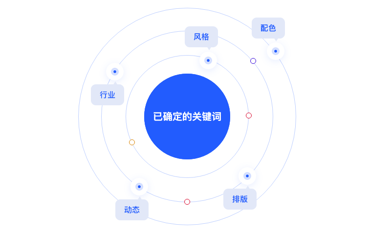
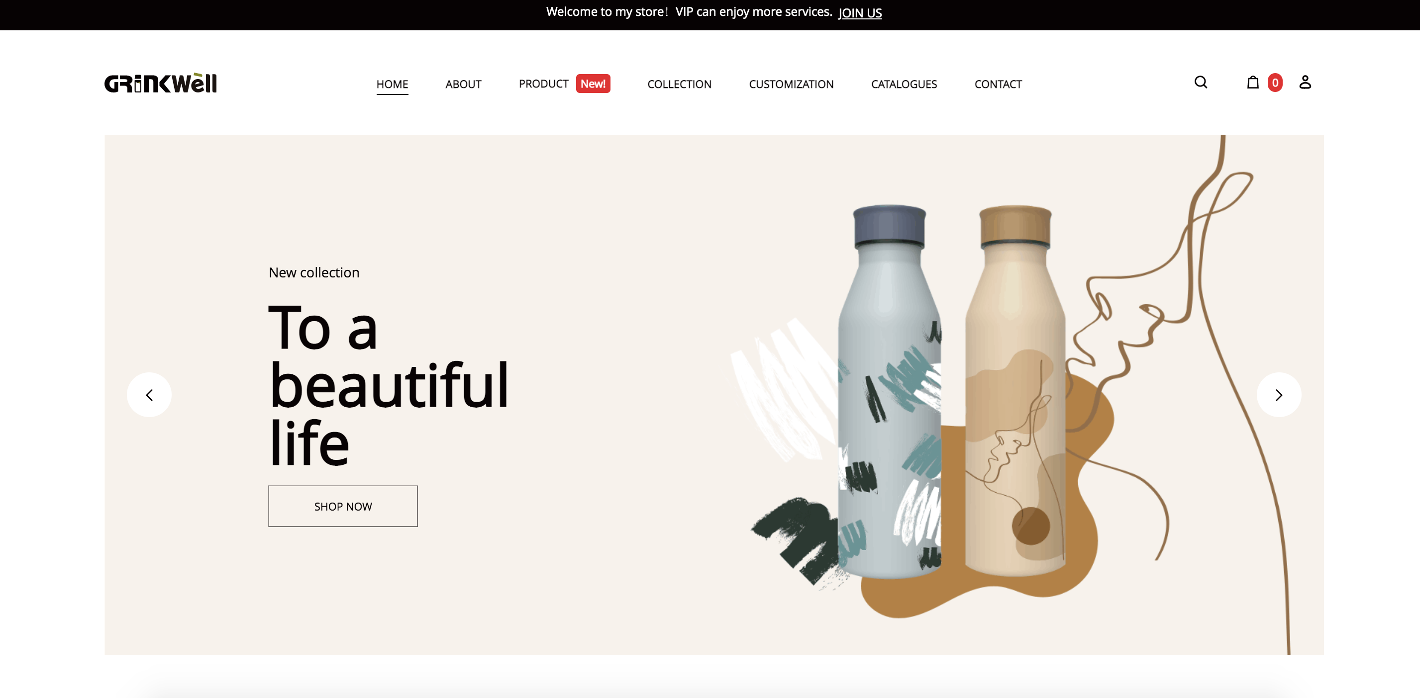
For example: Taking a thermos product as an example, we brainstorm as many words related to enterprises, industries, products and users as possible (these keywords are required, see Note 1 for details), product prototype, packaging, volume, material, color, customization, etc., and select the final visual presentation words through overlay and overlay as the design basis and creative distribution starting point of the project. This may be a single keyword, or it may be multiple, but the principle is that they do not overlap, for example, welldrink's keyword is sticker, customized.
Then through the user's "mental model" analysis of user behavior psychology, practical, good-looking, convenient purchase, social sharing, to improve the design section.
5. Crazy inspiration
Our design is never hard work, website design needs commercial, business needs market verification, we need to sort out a large number of websites to quickly get inspired, follow a few principles to find inspiration, according to the "positioning", "target words", "mental model" based on mass search, and through ① collection; ② Extraction; Repeat 1 and 2 to maximize input and output.
|
ps:Before I met a customer, I feel that there is nothing to change, but it is to change, we can be sure that the minimalist Mufeng design inspiration is not less than the customer, I believe that we will adopt the right enterprise and the right design form for the target user.
|

6. Design landing
6.1 Color scheme
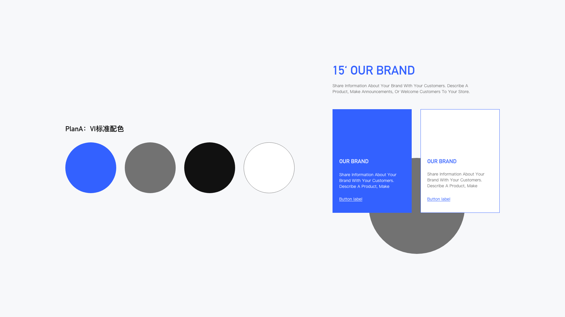
Many companies we contact do not have a complete VI manual, but only a logo. We need to continue and expand the color proportion of the website according to the existing Vi manual or simple logo. Blue color logo does not mean that the webpage only uses blue, black and white, but needs to match with auxiliary colors. Design a visual effect with active vitality that can form the first feeling of the brand.


6.2 Brand element
Element refers to a set of visual display collocation standards designed by our visual system, taking the icon as an example, there are linear, fill, 2.5d, static, dynamic and other forms of expression.
6.3 Exquisite layout
Consider responsive + in line with user reading habits, from left to right, top to bottom, and from large to small
6.4 Detail control
Icon design, button design, open screen design, scale application
6.5 Interaction design
Dynamic interaction, trigger interaction, feedback interaction, path guided interaction
6.6 Gold 15 seconds re-enabled - Memory Point crafting
|
Conversion, re-purchase, maximize the value of the website and the best transformation, so that users remember
|
A good brand needs to have a brand first impression, it can be color, shape, feeling, Apple advanced, lot cheap, minimalist Mufeng minimalist, Chinese wind China red, group atmosphere, etc., for the website, we need to create the first impression of the website, advanced, atmospheric, white space, large text, c4d picture, interesting buttons and so on. Must be able to bring out the brand feeling, a website only do an excellent highlight can focus on the highlights, so that users can quickly remember the characteristics of the brand.
6.7 Prototype confirmation and effect drawing
|
Prototype is an important step of planning landing and user experience combing, through the prototype can quickly plan the content of the page, the relationship between the website pages, simulate the user journey. It should be noted that all planning should be based on the real content that can be provided, and the prototype must be the content that can be landed, so as to ensure the consistency of subsequent implementation.
|

三、Appreciation of excellent cases of PithyMfweb
Decathlon perfly
The navigation entry is based on three user habits: crowd navigation, product category navigation, news and contact navigation
Product shelf display, all products in the same interface, by adding comparison, add to the shopping cart, guide the purchase
The combination of sets is recommended
Data is automatically updated for tens of thousands of products
http://perfly.mfweb.club/

Luzun International
Sticker packaging design
Shopping list submission
Member center
http://luzunmaoyi.mfweb.club/

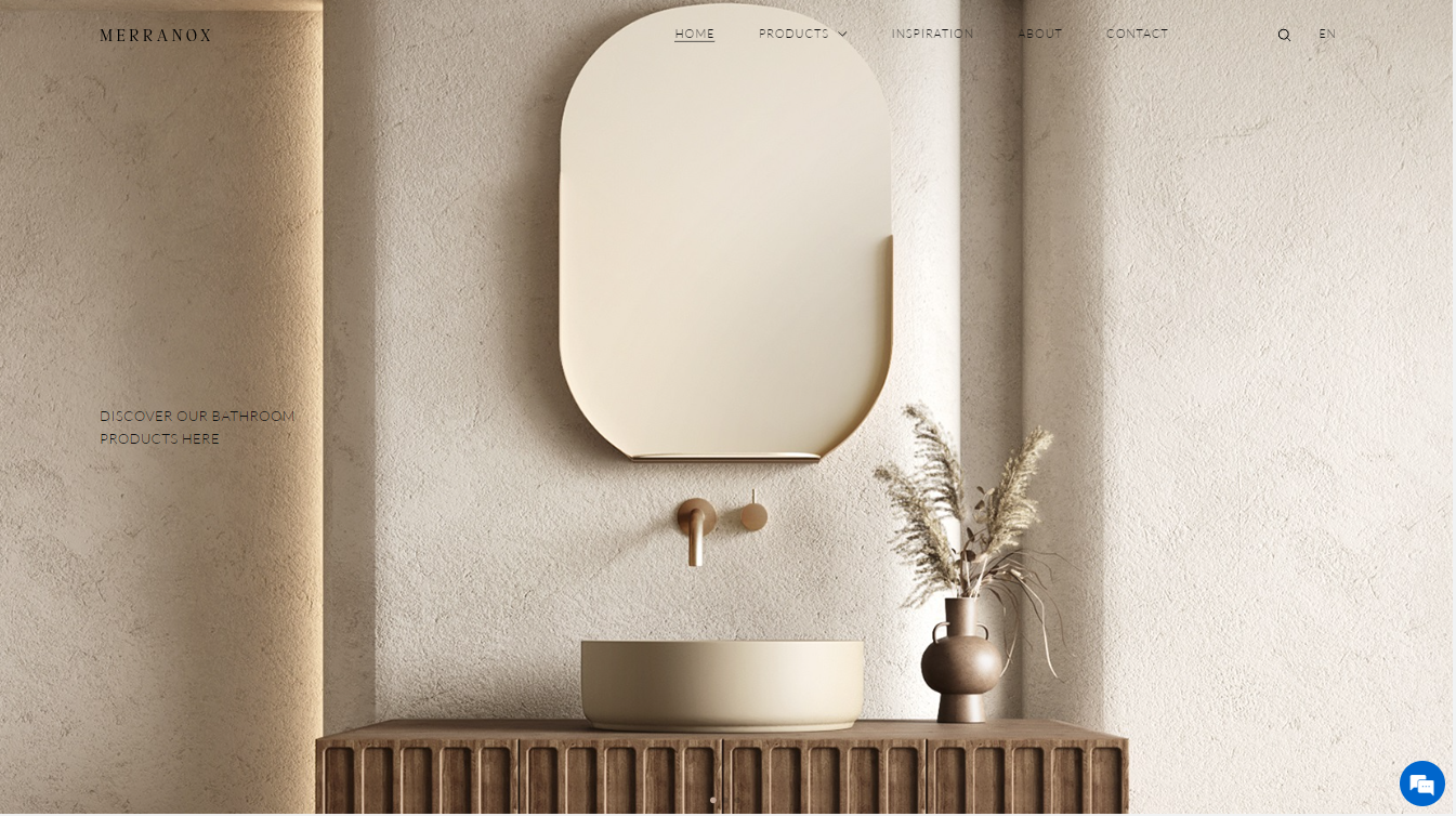
MERRANOX
Weaken the text and emphasize the product and scene
Clean side navigation to quickly find the desired product
https://merranox.com/

UNDORABLE
The dark background highlights the advanced sense of the product
Booklets reduce maintenance costs
http://www.undorable.com/

Methodology
PithyMfweb- Define Business brand website, more methodology please see:
《Official website design must see the user's mental thinking/guide》
《Official website design must see the brand thinking/guide》
《A must-see brainstorm/guide to design》
《Official website design must see color thinking/guide》
《Official website design must see inspiration thinking/guide》
DISCLAIMERS
back to list

